


Stay Updated with Everything about MDS
Thank you! Your submission has been received!
Oops! Something went wrong while submitting the form.

Chilat Doina
September 18, 2025
Analyzing sales data is all about digging into your transactional information—collecting it, cleaning it up, and turning it into visuals you can actually understand. It’s how you find the hidden patterns that should be driving your business decisions.
It’s about asking why customers are buying, what’s making certain products fly off the shelves, and where your next big revenue opportunity is hiding. If you want sustainable e-commerce growth, you have to get good at this.
Let's get one thing straight: sales data isn't just a boring spreadsheet of numbers. It’s a story about your customers, your products, and the real health of your business. In today's market, knowing how to read that story isn't just a 'nice-to-have'—it's what separates the winners from everyone else.
Global eCommerce sales are on track to hit a staggering $7.5 trillion in 2025, a huge jump from $5.7 trillion in 2023. That kind of scale means there's a mountain of data out there. The businesses that can make sense of it are the ones that will build winning strategies.
This isn't about becoming a data scientist overnight. It’s about learning to ask the right questions:
Answering these questions is how you turn raw numbers into intelligence you can act on.
Before you jump into complex charts, you need to understand the two main ways you'll be looking at your data: descriptively and predictively.
Descriptive analysis looks in the rearview mirror. It tells you what already happened, like your total revenue last quarter or your best-selling item in May.
Predictive analysis, on the other hand, tries to look into the future. It uses all that historical data to forecast what's likely to happen next, like spotting sales trends before they peak.
The real goal is to connect these two views to get a complete picture. Building this foundation is a core part of making smarter, data-driven decisions for your business.
The real power of sales data isn’t in the numbers themselves, but in the connections you make between them. A drop in sales isn’t just a metric; it's a signal to investigate everything from a recent website change to a new competitor's marketing campaign.
To put it in context, here’s a look at the typical components that make up a sales operation. This is the ecosystem where your data lives and breathes.

This chart shows how strategy, performance measurement, and technology all have to work together. And what’s sitting right at the heart of it all? Effective data analysis, which informs and improves every single piece of the puzzle.
If you're just getting started, the sheer number of available metrics can feel overwhelming. Don't try to track everything at once. Instead, focus on a handful of key performance indicators (KPIs) that give you the clearest picture of your business health. This table breaks down the essentials.
Think of these metrics as your dashboard. By keeping a close eye on them, you can quickly spot trends, identify problems, and make informed decisions to steer your business in the right direction.
So, you want to analyze your sales data. The thought of staring down a massive, messy spreadsheet can be pretty overwhelming. Where do you even begin?
Instead of getting lost in the numbers, I've found it's best to break the process down into four distinct pillars. Each one builds on the last, turning that raw data into a clear story that can actually guide your strategy. It’s a systematic approach, and it’s more important than ever.
The global data analytics market is projected to skyrocket from $82.23 billion in 2025 to a whopping $402.70 billion by 2032. That’s not just a random statistic; it shows how critical it is for businesses like yours to get a handle on interpreting complex sales information.
First things first: you have to gather your data. I call this the Data Collection pillar. The goal here is to pull all the relevant information from its various homes without pulling your hair out.
Your data is probably scattered across a few different places—your e-commerce platform like Shopify or BigCommerce, your CRM, maybe some marketing analytics tools. The trick is to pull it all together cleanly. Before you even think about exporting a CSV, get crystal clear on the timeframe you're analyzing and the specific numbers you need to see. Having a solid grasp of the foundational ecommerce performance metrics is a non-negotiable first step.
This simple flow chart really nails the concept:
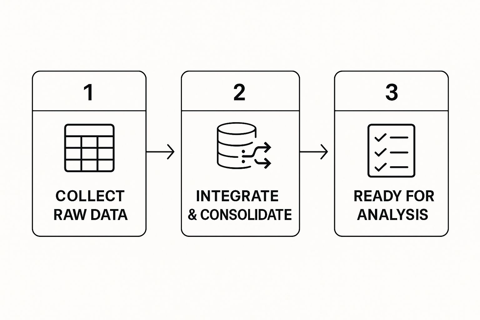
As you can see, good analysis doesn’t start with fancy charts. It starts with methodically collecting and combining your information into a single, usable dataset.
Next up is Data Cleaning, the unsung hero of any good analysis. Trust me, skipping this step is a recipe for disaster. I’ve seen it happen—a few duplicate entries or some missing values can throw off your entire analysis and lead to some seriously wrong conclusions. This is where you have to roll up your sleeves and fix the inevitable messiness.
Common tasks you'll run into include:
A mentor once told me, "Garbage in, garbage out." He was right. The time you invest in cleaning your data pays for itself tenfold by making sure the insights you find are actually accurate and trustworthy.
With your data all squeaky clean, you can move on to the third pillar: Data Visualization. This is the fun part, where you get to turn all those rows and columns of numbers into charts, graphs, and dashboards that actually make sense.
The goal here isn't just to make pretty pictures. It's to reveal patterns and trends that are practically invisible in a spreadsheet. Tools like Google Data Studio, Tableau, or even the charting features baked into Excel can help you build visuals that tell a story. For instance, a simple line chart can show you sales trends over the past year, while a bar chart can quickly compare how different products are performing against each other.
Finally, we land on Interpretation. This is where you connect the dots. You take everything you've found and translate it into specific, actionable business strategies. What does that dip in sales last quarter really mean? Why is one customer segment wildly more profitable than another?
This last pillar is all about answering the "so what?" question. If your data shows a high cart abandonment rate, the interpretation isn't just "people are leaving." The action is to figure out why and optimize your checkout process. This final step is what turns a data project from an academic exercise into something that directly drives growth and improves your bottom line.
Picking the right tools to look at your sales data can feel like a huge, intimidating decision, but it really doesn't need to be. The goal is to land on a toolkit that fits where you are right now—your budget, your team's tech skills, and your immediate needs—while still giving you some room to grow. You might be surprised to find out the best tool to start with is probably already on your computer.
A lot of businesses jump the gun, thinking they need some expensive, complex platform right out of the gate. The truth is, you can dig up some incredibly powerful insights with a basic spreadsheet. Tools like Microsoft Excel or Google Sheets are perfect for getting your feet wet and are way more powerful than most people give them credit for.
For small businesses or anyone just dipping their toes into sales analysis, spreadsheets are your best friend. They’re fantastic for cleaning up messy data, running simple calculations, and whipping up basic charts.
The real magic, though, is in the pivot table. This single feature lets you slice, dice, and summarize huge amounts of data in seconds.
Let’s say you have a spreadsheet with every single sale from the last quarter. With a quick pivot table, you can get answers to crucial questions in just a few clicks:
Just learning this one function can instantly shine a light on your biggest wins and hidden opportunities, all without costing you a single penny.
Eventually, as your business and your data grow, you'll start to feel the limitations of spreadsheets. That’s your cue to start looking at dedicated Business Intelligence (BI) platforms. Tools like Tableau or Microsoft Power BI are built to handle massive datasets and create interactive, live dashboards. They can plug directly into different data sources, which automates a huge chunk of the data collection grind.
Here’s a peek at what a dynamic dashboard in Tableau looks like.
This dashboard shows how a BI tool can pull together different metrics—sales, profit, order numbers—into one clean, interactive view. You can click to drill down into specific regions or time periods, giving you a much deeper understanding than any static chart ever could.
Don't forget about the analytics suite that's likely already built into your Customer Relationship Management (CRM) platform. If you're using something like HubSpot or Salesforce, their built-in reporting tools can offer amazing insights into your sales pipeline, team performance, and customer journey without you ever having to export a single file.
The market for these tools is exploding for a reason. It was valued at $48.56 billion in 2023 and is projected to skyrocket to $140.47 billion by 2032. This growth shows just how vital these platforms have become for businesses that want to make precise, data-backed decisions. You can read more about the latest trends in data analysis tools on dataintelo.com.
Choosing the right platform can be tricky. Here’s a quick rundown of some popular options to help you see how they stack up against each other.
Ultimately, there's no single "best" tool—only the best tool for your specific situation and goals.
Pro-Tip: Don't get distracted by a long list of features. Instead, write down the top five sales questions you absolutely need answers to, then find the simplest tool that gets you those answers.
The right tool really just depends on your scale. If you're a seven-figure seller, you might need something more advanced, but never underestimate the power of starting simple. When you're ready to level up, take a look at our guide on how to drive sales with AI and advanced analytics. Your toolkit should grow right alongside your business.

Alright, once you've got the basics down, it’s time for the fun part. The real competitive advantage in e-commerce comes from spotting the hidden patterns in your sales data—the stuff most of your rivals are completely missing. This is where you graduate from simply pulling reports to asking smarter questions about why your customers do what they do.
These advanced techniques aren't about getting bogged down in complex math. It’s about looking at your data from different angles to find some powerful truths. Think of it like switching from a flat, two-dimensional map to a 3D one. All of a sudden, you can see the hills and valleys that were invisible before.
One of the most powerful things you can do with your data is customer segmentation. Instead of treating all your customers like one giant, faceless mob, you start sorting them into smaller, distinct buckets based on things they have in common. This lets you get incredibly sharp with your marketing and product development.
You can slice up your audience in a few key ways:
Imagine an online apparel store. They might dig in and find a segment of customers who consistently buy a new pair of running shoes every three months. Instead of just hoping they come back, the store can get proactive. They can send a personalized email showcasing new arrivals exactly 90 days after the last purchase, which drastically increases the chances of another sale.
While segmentation gives you a snapshot of who your customers are right now, cohort analysis tracks how they behave over time. A "cohort" is just a fancy word for a group of customers who all started their journey with you in the same period—for example, everyone who made their first purchase in January.
By following this group month after month, you can answer some massive questions about customer loyalty and retention. You might discover that customers you picked up during a big Black Friday sale have a much lower repeat purchase rate than the ones who found you through your blog content.
Cohort analysis is like a loyalty report card for your business. It tells you if you're getting better or worse at keeping customers engaged long after their first purchase, which is the key to sustainable growth.
This kind of insight is pure gold. It tells you to double down on content marketing to attract high-quality, long-term customers instead of just chasing short-term revenue spikes from discount-seekers.
This might sound a little like science fiction, but predictive analytics is more accessible than ever. It uses your historical sales data, a bit of machine learning, and some statistical algorithms to make educated guesses about what's going to happen next. It's the ultimate forward-looking view.
Here are a few ways this plays out in the real world of e-commerce:
When you start applying these advanced methods, you stop reacting to what’s already happened and start proactively shaping what will happen next. It’s the difference between just reading your sales data and actually having a conversation with it.
All that analysis is just a fun academic exercise if it sits in a folder on your drive. The most critical part of this whole process is turning those hard-won insights into actual, tangible business decisions. This is where you shift from being a number-cruncher to a storyteller who can drive real change.
The secret? Master the art of data storytelling. You have to build a clear, compelling narrative that guides your team toward a specific, data-backed conclusion. Raw data is just noise; a story makes it persuasive. So instead of just dropping a chart showing a sales dip into a slide deck, you frame it as a challenge and present your analysis as the road map to a solution.
One of the biggest mistakes I see people make is sending the same report to everyone. Your findings will land very differently depending on who’s in the room, so you absolutely have to tailor your message.
Think about what each department actually cares about day-to-day.
When you frame your recommendations in the language your audience speaks—revenue, cost savings, customer retention—your insights become immediately relevant and impossible to ignore. For a deeper look at this, you can learn more about how to improve profit margins by connecting operational tweaks directly to financial outcomes.
Don’t just show people data; tell them what it means for them. Your goal is to make it so compelling they have no choice but to act on what the numbers are saying.
For leadership, clarity and speed are everything. Your CEO doesn’t have 20 minutes to dig through a spreadsheet; they need the highlights in 30 seconds. This is where a clean, one-page dashboard becomes your best friend. It should spotlight the most important KPIs and trends at a glance, using dead-simple visuals like big numbers and bar charts.
Once you’ve distilled your analysis into these key takeaways, the final step is to package them up and present them with confidence. A structured report is often the best way to do this. To get a head start, you can download a helpful effective sales report template that gives you a solid framework for presenting your findings. This is the moment that separates analysis from action—it’s what inspires real, meaningful change in your business.

Even with a solid game plan, you're bound to run into a few questions once you start digging into your sales data. It happens to everyone. Let's tackle some of the most common hurdles I see sellers face, so you can keep moving forward with confidence.
By far, the single biggest mistake is starting with "dirty" data. If your source information is riddled with duplicates, errors, or missing values, any conclusion you reach is built on a shaky foundation. Garbage in, garbage out.
Another classic pitfall is getting obsessed with vanity metrics. Sure, tracking total website visits might look impressive on a chart, but it’s not nearly as useful as knowing your conversion rate by marketing channel. Always, always focus on the KPIs that tie directly to your bottom line.
Finally, you have to be on guard for a couple of subtle but dangerous mental traps:
The real goal of analyzing your sales data isn't just to confirm your gut feelings. It's to challenge them. The biggest growth opportunities are often hiding in the insights you never saw coming.
There’s no magic number here, but the key is to find a consistent rhythm that works for you. I like to think of it in layers.
You should be glancing at your high-level dashboards—the ones with core metrics like daily revenue and conversion rates—every day, or at the very least, a few times a week. This is how you keep a finger on the pulse of your business.
For the deeper dives, like analyzing customer retention or reviewing quarterly performance, a monthly or quarterly schedule makes more sense. Big-picture strategic analysis for things like annual planning and forecasting naturally falls into a yearly cadence.
The point is to build a routine that lets you be proactive, not just constantly putting out fires.
You absolutely do not need an expensive software suite to get started. Some of the most powerful insights can be uncovered with tools that won't cost you a dime.
Google Analytics is a non-negotiable. It's an absolute powerhouse for tracking e-commerce transactions and seeing how customers behave on your site.
When it's time to crunch the numbers, Google Sheets is a fantastic free alternative to Excel, with all the pivot tables and charting features you’ll need early on.
Don't forget that your e-commerce platform, whether it's Shopify or WooCommerce, has its own built-in analytics dashboard. These are goldmines for understanding your products, customers, and sales trends. Get comfortable with these free resources before you even think about paying for a specialized tool.
At Million Dollar Sellers, we know that the right data is only half the battle. Sharing that data and the strategies behind it within the right community—that's the real key to scaling. Our members are top-tier e-commerce entrepreneurs who share the high-level plays that are actually working right now.
If you're an experienced seller ready to surround yourself with the best in the business, see if you qualify for our exclusive community.
Join the Ecom Entrepreneur Community for Vetted 7-9 Figure Ecommerce Founders
Learn MoreYou may also like:
Learn more about our special events!
Check Events.svg)
.svg)
.svg)

.svg)