


Stay Updated with Everything about MDS
Thank you! Your submission has been received!
Oops! Something went wrong while submitting the form.

Chilat Doina
October 18, 2025
So, what exactly are brand guidelines? Think of them as the official rulebook for how your brand looks, sounds, and acts. It's where you document everything from your mission and company values to the nitty-gritty details of your visual identity (logos, colors, fonts) and your verbal identity (that all-important tone of voice).
The goal is to make sure every piece of communication is consistent and instantly recognizable. This document becomes the single source of truth for your entire team.

Before we get into the "how," let's have an honest chat about the "why." I've seen it happen way too often: a company invests time and money into crafting beautiful brand guidelines, only for them to get buried in a shared drive, collecting digital dust.
Let me be clear: treating your brand guidelines as an afterthought is a huge mistake. This isn't just some fluffy rulebook; it's a strategic asset that has a very real impact on your bottom line.
A unified brand experience is what builds genuine trust. When customers see the same logos, colors, and voice on your website, your Amazon listing, your social media, and your product packaging, it sends a powerful message of reliability and professionalism. This is the kind of consistency that separates memorable brands from the ones that just fade into the background.
Without clear guidelines, your brand’s message gets messy, fast. Different teams start using slightly different shades of blue. Someone pulls an old, low-res logo for a social media post. Customer service emails sound formal and stuffy, while your marketing copy is fun and casual.
These might seem like small slips, but they add up.
The result is a fractured identity that confuses customers and weakens their connection to your brand. You end up wasting marketing dollars because every new campaign has to start from scratch, re-establishing who you are. A consistent brand, on the other hand, builds on itself, gaining momentum with every single interaction. A huge part of this is building brand awareness effectively.
The link between consistency and revenue isn't just a theory—the data backs it up. A cohesive brand presentation has been proven to drive serious financial growth.
In fact, companies that maintain brand consistency across all their platforms have seen their revenue jump by 10% to 20%. Even something as simple as using a consistent logo can contribute to a 23% revenue boost on its own. That's the power of a unified visual identity in action.
Your brand guidelines are the blueprint for building customer trust. Every consistent touchpoint is a promise kept, reinforcing that your brand is reliable, professional, and worthy of their loyalty.
Think of it this way: consistency is the foundation of a strong brand. It's what makes your business instantly recognizable and trusted in a ridiculously crowded market. As we cover in our guide on how to build brand awareness, developing this identity is non-negotiable.
The secret to making sure your brand guide actually gets used is getting your team on board from day one. When everyone—from marketing and sales to customer support and product development—understands that these guidelines are a tool for success, they become champions of the brand.
They’ll stop seeing the guide as a set of restrictive rules and start seeing it as a resource that empowers them to:
When you frame the process around these shared goals, your guidelines become more than just a document. They become a core part of your company culture, ensuring they are not just created but actively used and maintained.
Every logo, color, and font you choose needs to be anchored in something real. This is your brand's strategic foundation—the "why" behind every single "what." Without it, your brand guidelines are just a pretty rulebook. With it, they become the blueprint for building a brand that actually means something to people.
Think of this as your brand's soul. Before you can even think about what your brand looks like, you have to nail down who it is, what it stands for, and who you're trying to reach. Getting this right from the start ensures every decision you make, from a logo tweak to an Amazon A+ layout, is deliberate and pulls in the same direction.
This isn't about writing fluffy, corporate-sounding statements that get buried in a Google Drive folder. It's about digging deep to find the genuine principles that steer your business. These are the core ideas that will shape everything from your product descriptions to your customer service replies.
First things first, you need to get clear on the three pillars of your brand's purpose: your mission, vision, and values. These aren't just for internal memos; they're the foundation of your brand story and the promises you're making to your customers.
Let's break them down into simple questions you can actually answer:
This foundational work is critical for building a brand that feels coherent and powerful. If you want to go even deeper on this, we've got a whole guide on creating an effective ecommerce brand strategy.
The infographic below lays out how these strategic pieces fit together, with each one building on the last.
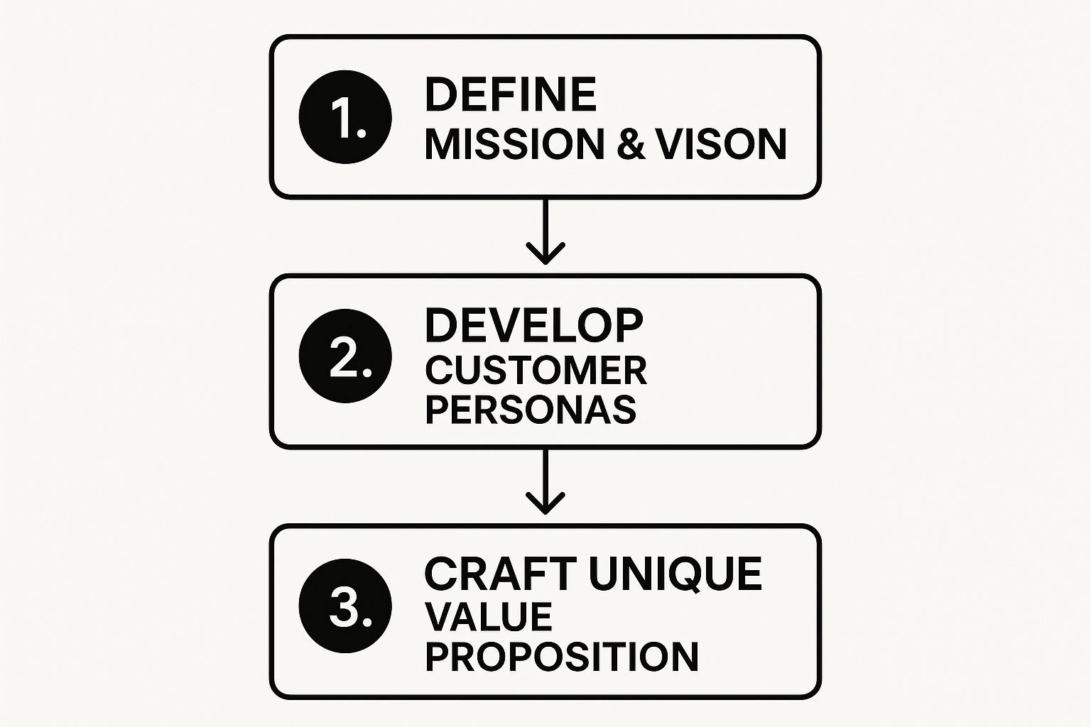
As you can see, defining your purpose is just the beginning. The next step is connecting that "why" directly to your customer.
To make this easier, here’s a quick breakdown of how these strategic pieces fit together. Think of it as your brand's DNA.
ComponentWhat It DefinesKey Question to AnswerMissionYour purpose in the presentWhat do we do, for whom, and why?VisionYour aspirational futureWhat change do we want to create?ValuesYour guiding principlesHow do we behave and make decisions?Customer PersonaYour ideal customerWho are we talking to and what do they care about?UVPYour unique market positionWhy should a customer choose us over anyone else?
This framework provides a clear roadmap, ensuring every part of your brand strategy is connected and serves a specific purpose.
Once you know who you are, you need to get crystal clear on who you're talking to. Generic demographics just won't cut it anymore. You need to create detailed customer personas that feel like real people, because they represent your real audience.
A truly useful persona goes way beyond age and location. It dives into psychographics—what motivates them, what keeps them up at night, what their goals are, and even what influencers they follow on Instagram. For any e-commerce brand, this stuff is pure gold.
Customer personas transform your marketing from a megaphone shouting at a crowd into a one-on-one conversation.
Imagine you sell sustainable home goods on Amazon. A lazy persona might be "eco-conscious millennials." A great persona is "Sustainable Sarah," a 32-year-old city-dweller who feels a little guilty about her carbon footprint, spends her Saturday mornings at the farmers' market, and actively seeks out zero-waste brands. See the difference? Now you can craft copy and choose images that speak directly to Sarah.
Okay, you've got a clear mission and you know your customer inside and out. Now it's time to craft your Unique Value Proposition (UVP). This is a simple, powerful statement that explains exactly how you solve your customer's problem better than anyone else. It's the sweet spot where what you do best meets what your ideal customer needs most.
Your UVP isn't just a tagline for your website header. It's the heart of your messaging and should shine through everywhere, from your brand story to your Amazon A+ Content. It has to answer three questions from your customer's point of view:
For instance, a generic brand might say, "We sell high-quality coffee." A brand with a killer UVP would say something like: "Ethically sourced, single-origin coffee, roasted to order and shipped within 48 hours, so you never have to drink stale coffee again." That's specific, valuable, and immediately sets them apart. This strategic groundwork is what turns your brand guidelines from a document into a powerful business asset.

Alright, with your brand strategy locked in, it's time for the fun part: giving your brand a face. This is where we translate all those big ideas—your mission, values, and personality—into a tangible visual language that people can see and connect with.
A strong visual identity is so much more than just a logo. It’s a complete, cohesive system of design elements that work together to make your brand instantly recognizable.
Think about it. Whether a customer sees your product on an Amazon listing, a post on Instagram, or the box that arrives at their door, the experience should feel consistent and professional. You're building a visual shorthand that communicates who you are without you ever having to say a word.
Every single element, from your logo’s placement to the specific shade of blue you use, needs to be intentional. This is how you go from just having a business to truly building a brand.
Your logo is the most concentrated version of your brand, so you have to protect its integrity. It's non-negotiable. Your brand guidelines need to lay out crystal-clear rules on how it should—and just as importantly, how it should not—be used. This kills any ambiguity and prevents those common logo mishaps that can dilute a brand’s power.
Think about all the places your logo will live and create rules for them. This isn't about being a design dictator; it's about ensuring consistency, everywhere.
Here are the key rules to nail down:
Your logo is your brand's signature. The rules you set aren't just for designers; they empower everyone on your team—from marketing to customer service—to represent the brand correctly. You're building visual equity with every single application.
Color is a shortcut to emotion. It’s a powerful tool for creating immediate brand recognition. A well-defined color palette ensures your brand’s "feel" is consistent across every single touchpoint, from your website’s buttons to your packaging inserts.
But your palette should be more than just one or two colors. A truly versatile system includes primary, secondary, and accent colors, giving your team flexibility while keeping everything looking cohesive.
For each color, you have to specify its exact codes for different mediums. In the past, this was just a simple list in a PDF. But things are changing. In 2025, brand guidelines are evolving into dynamic, living documents hosted on centralized hubs. These platforms let teams access the latest assets and guidelines instantly, including exact color codes in HEX for web, RGB for digital screens, and CMYK for print. They even include accessibility-focused contrast ratios to meet WCAG standards. This modern approach ensures your branding can adapt quickly while maintaining strict consistency.
Your color palette should include:
Typography is your brand’s voice, made visible. The fonts you pick have their own distinct personalities, and they absolutely need to align with the brand personality you defined earlier.
Are you modern and minimalist? A clean, sans-serif font like Inter might be a great fit. Are you more traditional and trustworthy? A classic serif like Garamond could do the trick.
Your guidelines should establish a clear typographic hierarchy. This tells your team which font to use for what purpose, creating visual order and making everything much easier to read.
A typical hierarchy looks like this:
Finally, your guidelines have to steer the visual style of your photography and iconography. This is what makes every image, whether it's a product shot for your Amazon listing or an icon on your website, feel like it came from the same brand family.
For photography, define the overall mood. Should your images be bright and airy or dark and moody? Should they feature people, and if so, what should the models be doing? For e-commerce brands, high-quality visuals are everything, so clear direction here is crucial. We offer some practical advice in our guide on finding affordable product photography that doesn't sacrifice quality.
For iconography, specify the style. Are your icons simple and line-based, or are they filled and detailed? Providing a starter set of custom icons is a great way to ensure consistency right from the start. This level of detail is what separates good brands from great ones—it creates a truly immersive and recognizable world for your customers.

If your brand could talk, what would it sound like? This is where we get past the visuals and start shaping your brand's verbal identity—a piece of the puzzle that’s just as critical as your logo, yet so often gets pushed to the back burner.
Your brand’s voice isn't just what you say, it's how you say it. It’s the consistent personality that shows up in every single piece of writing, from a punchy ad headline all the way down to a boring password reset email. This consistency is what builds a real, human connection with your customers.
One of the biggest hurdles I see teams struggle with is the subtle but crucial difference between voice and tone. Getting this right is what makes your brand guidelines actually usable for your team.
Think of it this way: You have one personality (your voice), but you speak to your best friend differently than you speak to your boss (your tone). The core "you" is always there, but you adjust your delivery.
For an e-commerce brand, this distinction is everything. Your witty, confident voice stays the same, but your tone will shift dramatically between these scenarios:
The goal is for it to sound like the same brand in every instance, just with a different emotional filter applied.
Abstract descriptions like "friendly and authentic" are a good start, but they aren't enough. You have to translate those ideas into concrete rules that a writer can actually follow. The best way I've found to do this is with a simple "Do's and Don'ts" chart.
This approach strips away the ambiguity and gives your team a clear framework. For example, if your brand voice is "Expert but Approachable," your rules might look something like this:
We Sound Like This... (Do)Not Like This... (Don't)Confident & Clear: We use strong, active verbs.Academic & Stuffy: We avoid jargon and overly complex sentences.Helpful & Guiding: We offer practical, actionable advice.Bossy & Arrogant: We never talk down to our customers.Warm & Personable: We use contractions (e.g., you're, it's).Cold & Robotic: We avoid overly formal language and passive voice.
This kind of clear guidance is invaluable. It’s the difference between a writer guessing what the brand should sound like and knowing how to execute it. To really nail this down, it helps to build out an effective brand message strategy that underpins all your communication.
Finally, your guidelines need to lock in your core messaging pillars. These are the three to five key themes you want to own in your customers' minds. Every piece of content you create—every email, every social post, every product description—should reinforce at least one of these pillars.
For an Amazon brand selling premium kitchen gadgets, your pillars might be:
This isn't just about making things look pretty; it's about building a brand people connect with. Consider that 81% of consumers say they need to trust a brand before buying from them, and 77% prefer shopping with brands they follow on social media. That trust is built through a consistent voice and messaging.
Even humor can be a powerful tool—91% of consumers prefer funny brands, a move that can make advertising six times more effective. By defining your voice, tone, and messaging pillars, you equip everyone on your team to communicate with a single, powerful voice that cuts through the noise and builds real customer loyalty.
You’ve done the hard work and built your brand guidelines. That’s a massive win, but don’t pop the champagne just yet. The most beautiful, well-thought-out brand book is completely useless if it’s just gathering digital dust in a forgotten folder.
Now comes the part that really matters: bringing it to life. We need to turn that document from a static file into a living, breathing resource that your whole team actually wants to use.
This is where brand consistency is truly won or lost. The goal is to make following the guidelines the path of least resistance for everyone, from your marketing intern to that freelance packaging designer you just hired. A great launch isn't about sending a single "FYI" email; it's about creating a culture where everyone feels like a brand champion.
First things first, you have to decide how you'll package and present your guidelines. This choice has a huge impact on whether your guide gets used or ignored.
A simple PDF is the classic go-to, and it's fine for a starting point. But let's be honest, it has some serious drawbacks.
Static PDFs are a nightmare for version control. Every time you tweak a color hex code or update a logo, you’re stuck hunting down every old copy and trying to make sure everyone has the new one. It’s chaos.
A much smarter approach is a dynamic, online brand hub.
Your brand guidelines shouldn't feel like a rigid, scary rulebook. Think of it as an empowering toolkit. The easier you make it for your team to grab what they need, the more likely they are to use it right.
For smaller teams, a well-organized Notion page or even a Google Site can do the trick beautifully. If you’re a larger operation, you might want to look into dedicated platforms like Frontify or Brandfolder that are built to manage brand assets at scale.
Nothing kills adoption faster than intimidation. If your guide looks like an 80-page legal contract, I guarantee you no one is going to read it. You need to design it for quick scans and easy reference.
Kick things off with a clear, clickable table of contents. From there, structure the content logically. Start broad with the high-level stuff (mission, voice, values) and then drill down into the nitty-gritty visual rules (logo usage, colors, typography). Use clear headings and plenty of visual examples to break up the text.
Here’s a pro tip: create a "Quick Start Guide" or a "One-Pager" section. This is an absolute game-changer. It’s a super-scannable summary that includes just the essentials:
This little cheat sheet is perfect for freelancers, agencies, or new hires who need to get moving fast without getting bogged down in the details.
A successful launch is all about getting your team on board. Don't just fire off an email with a link and cross your fingers.
Schedule a launch meeting or a fun workshop. Actually walk your team through the guidelines and explain the why behind the decisions. When people understand the reasoning, they're much more likely to follow the rules. Frame it as a tool designed to make their jobs easier and their work stronger.
Finally, you need a process for keeping it current. Your brand isn't static, so your guidelines shouldn't be either. Appoint a "brand guardian" or a small committee to own the document. They'll be responsible for reviewing and approving any changes. Plan on doing a full review once a year to make sure everything still aligns with your business goals, and make small tweaks as needed along the way.
This turns your guide into a living document that grows right alongside your brand, empowering everyone to be a confident and consistent brand builder.
Even with the best plan in the world, you’re bound to have questions once you start putting your brand guidelines together. Think of this section as your practical, no-fluff troubleshooting guide.
We’re going to tackle the real-world questions that always seem to pop up. Getting these details right can be the difference between a guide your team actually uses and one that just collects dust.
Your brand guidelines should be a living document, not something carved in stone. Your brand is going to evolve as your business grows, and your guide needs to keep pace. Sticking to an outdated rulebook will only hold you back.
I recommend a full, comprehensive review at least annually. This is your chance to zoom out and make sure your guidelines still line up with your big-picture business goals and where you sit in the market.
But you'll also need to make smaller updates more often. For instance:
This is why I always push brands to use a dynamic, digital brand hub instead of a static PDF. It makes these ongoing tweaks a breeze to manage and push out to the entire team instantly.
Hands down, the single biggest pitfall is making your guidelines either way too rigid or far too abstract. Both extremes lead to the exact same place: nobody uses them.
If the rules are so strict they choke all creativity, your team will just find workarounds or ignore them completely. A brand guide should be a framework, not a creative straitjacket. It’s there to guide, not to dictate every single pixel.
On the flip side, a guide filled with vague statements like "be authentic" without any concrete examples is just as useless. Your team needs to see what the brand looks like in the wild. You absolutely must include practical mockups.
Show them what it looks like:
The best brand guidelines I've ever seen provide a clear framework but still empower creativity within it. They strike that perfect balance between rules and inspiration, showing your team how to be creative while staying perfectly on-brand.
Yes. 100% yes. In fact, creating them when you're small is the smartest move you can make. It gets good habits baked in from the very beginning and builds a strong, consistent foundation before things get messy.
It’s easy to think everyone's on the same page when your team is just a few people. But what happens when you grow? When you hire new employees, bring on freelancers, or start working with agencies? That unwritten knowledge falls apart fast.
Having a guide in place means every new person can get up to speed quickly and represent your brand the right way from day one. Even a simple, one-page guide covering your logo, colors, fonts, and core message is infinitely better than nothing. It's a non-negotiable step in building a professional brand that can scale.
At Million Dollar Sellers, we know that building a powerful, consistent brand is key to scaling your e-commerce business. Our exclusive community provides the peer support, advanced strategies, and behind-the-scenes insights you need to overcome growth plateaus and stay ahead of the curve. If you’re a top e-commerce entrepreneur ready to connect with the best in the business, find out if you qualify for MDS.
Learn more at https://milliondollarsellers.com.
Join the Ecom Entrepreneur Community for Vetted 7-9 Figure Ecommerce Founders
Learn MoreYou may also like:
Learn more about our special events!
Check Events.svg)
.svg)
.svg)

.svg)