
Chilat Doina
July 18, 2026
Most advice on Amazon images is too soft. It tells sellers how to stay live, not how to win.
The biggest example is the 1,000-pixel myth. Sellers hear that number, upload images that technically pass, and assume the job is done. That's a compliance mindset. Serious operators care about what the image does after the listing is live: whether it earns the click, supports zoom, answers objections, and keeps the listing out of suppression workflows.
The other problem is that many guides focus on obvious violations and ignore the quiet ones. A background that looks white but isn't exactly white. A product that feels centered but doesn't hit the frame-fill requirement. A multi-pack title that says one quantity while the main image shows another. Those mistakes don't just create friction. They can remove revenue from your listing without much warning.
If you're working on image requirements for Amazon at a high level, treat images as part compliance system, part conversion engine. The main image gets you into the game. The rest of the image stack closes the gap between curiosity and purchase. If you're also building out richer brand content, this primer on what Amazon EBC is and how it fits the listing experience helps frame where images sit in the broader merchandising stack.
Amazon's minimums are not your target. They're the floor.
A lot of sellers still build their image workflow around “good enough.” If the file uploads, the background looks white, and the image is large enough to avoid rejection, they move on to PPC, pricing, or reviews. That's backwards. On Amazon, the image is often the first serious conversion lever you control.
The difference matters most on crowded search result pages. A compliant image can still look weak in thumbnail view. A compliant image can still fail to communicate size, finish, or product configuration. A compliant image can still lose the click to a cleaner, sharper competitor image.
That's why the right standard for image requirements for Amazon isn't “Will this upload?” It's “Will this image make the product easier to trust and easier to buy?”
Practical rule: Build images for search, mobile, and zoom behavior first. Policy compliance comes with that process, not instead of it.
The first is treating image production like a one-time design task. It isn't. It's merchandising. Your image stack should answer buyer questions in sequence.
The second is assuming Amazon will always tell you when there's a problem. It won't. Some image issues are obvious because the listing gets blocked. Others are expensive because the listing stays up while performance suffers, or because suppression happens after a catalog mismatch that someone on the team missed.
Strong sellers separate minimum requirements from revenue requirements. That's the gap that usually decides whether an image set is merely acceptable or commercially useful.
The main image is the hardest-working asset on the listing. It has one job in search and category pages: get the click without triggering compliance problems.
Amazon's rules here are strict for a reason. The platform wants visual consistency in search results, and it enforces that through hard technical standards. For main images, the product must occupy at least 85% of the image frame, sit on a pure white background with exact RGB 255, 255, 255, and the image must be at least 1,000 pixels on the longest side to activate zoom. The file must be 10 MB or less, use sRGB, and be uploaded as JPEG, PNG, TIFF, or non-animated GIF, with JPEG preferred, according to this breakdown of Amazon main image requirements.

These are hard rules, not stylistic preferences:
Search results on Amazon are visual comparison engines. A weak main image doesn't just look less polished. It makes the product look less certain.
If the product appears too small in the frame, the buyer works harder to identify what's being sold. If the white background is inconsistent, the listing looks less native inside the grid. If extra badges or props show up, buyers may click less confidently or Amazon may suppress the image outright.
Clean main images outperform busy ones because they reduce interpretation. The buyer sees the product fast, understands what's included, and decides faster.
What works is disciplined production. Shoot or export specifically for Amazon. Check the corners for exact white values. Crop for dominance, not breathing room. Review the thumbnail at small size before you upload the full-resolution file.
What fails is trying to make the main image do too much. Don't use it to explain benefits. Don't decorate it. Don't “brand it up.” Amazon gives you secondary slots for that. The main image is a product identification asset first, a persuasion asset second.
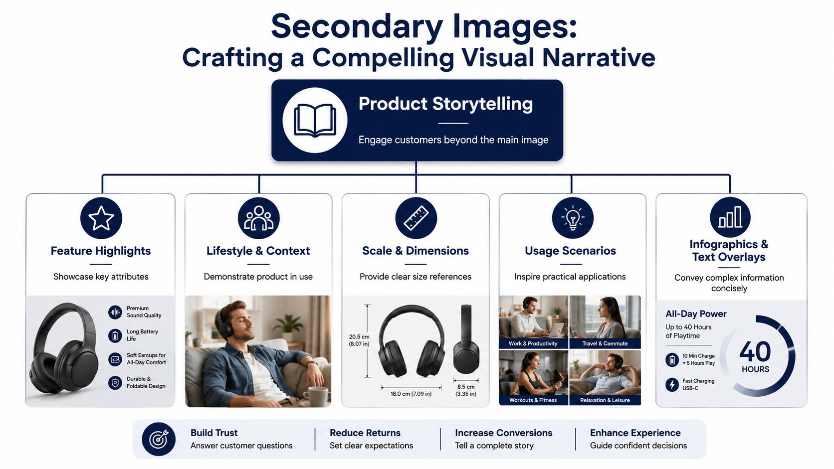
Secondary images carry more conversion weight than a lot of sellers admit. The main image gets the click. The rest of the carousel decides whether that traffic buys, bounces, or returns the product later because the listing failed to set expectations.
The mistake I see often is treating secondary slots like brand decoration. On Amazon, they are sales assets. Each image should answer a buying question, remove a hesitation, or prevent a mismatch that turns into a refund. Listings with a full image stack usually convert better than listings that stop at two or three weak photos, but the primary gain comes from what those images explain, not from filling slots for the sake of it.
If your team needs a tighter production standard, this guide to product photography for Amazon covers the operational side well.
A strong carousel follows buyer friction in order. The first secondary image should usually answer the biggest question left after the main image. For one product, that may be scale. For another, it may be what is included in the box. For a multi-pack, it is often pack count and unit presentation. Get that wrong and you can inadvertently lose sales or trigger image suppression if the visuals do not match the offer.
I push sellers to review secondary images with two lenses. First, what drives the sale. Second, what keeps the listing safe. Amazon does not just evaluate whether an image looks good. It evaluates whether the image accurately represents the exact item, quantity, and variation being sold.
Show the product in the environment where the buyer will use it. That helps with fit, scale, and context fast. For apparel, show how it sits on the body. For home goods, show it in the room. For tools or accessories, show the actual use case, not a styled scene that hides the product.
This is one of the most overlooked revenue levers. If you sell bundles, kits, or multi-packs, dedicate an image to the exact count and contents. Spell out what is included visually. Do not assume the title will do enough work. A mismatch between the offer and the image stack causes confusion first, then complaints, then catalog problems.
Use detail shots for materials, finish, seams, closures, ports, edges, and hardware. Buyers use these images to judge whether the product feels cheap. If the close-up is soft, dark, or over-retouched, the product quality feels uncertain.
Dimension graphics reduce returns. So do compatibility callouts for products that need to fit another item, space, or body type. If shoppers have to estimate scale on their own, many will estimate wrong.
A productive image stack usually includes:
Skip duplicate angles unless they resolve a different objection.
A lot of suppression issues start in secondary images, not just the main image. Multi-pack listings are where this shows up most. If the detail page sells a 6-pack but the carousel leads with imagery that looks like a single unit, or mixes single-unit lifestyle shots with bundle claims, Amazon can flag the listing for inconsistency. Even when suppression does not happen, conversion drops because buyers hesitate over what they will receive.
The fix is simple. Match every image to the child ASIN being sold. If the listing is a 3-pack, show a 3-pack clearly. If the variation is a different size or color, the carousel for that variation should reflect it. This sounds basic. It is also where a lot of catalog teams lose revenue without realizing the images caused it.
Many brands waste early image slots on mood. Amazon shoppers usually want certainty before they want story. Front-load clarity. Put context, contents, size, and quality proof early in the carousel. Use later slots for richer brand positioning once the buyer already understands the offer.
That order improves conversion because it answers the questions that stop the sale. It also cuts down on the post-purchase friction that shows up later as returns, bad reviews, and account headaches.
Amazon does not care how expensive your shoot was if the file breaks platform rules. Bad exports cost traffic, suppress listings, and create catalog mess that slows updates across parent-child variations.
Treat technical specs as revenue protection. The file needs to upload cleanly, render sharply on mobile, and stay aligned with the offer shown on the detail page. That last part gets missed a lot, especially on multi-packs where image files and variation data drift out of sync.
Use RGB or sRGB color space. Exporting in sRGB is the safer call because it keeps color more consistent across devices and reduces ugly shifts that make products look off-brand or inaccurate.
Amazon accepts images with a minimum display resolution of 72 dpi and a maximum size of 10,000 pixels on the longest side. That minimum is not the target. For selling, teams should build image assets that reach at least 1600 pixels on the longest side so shoppers can inspect details clearly. Amazon may accept smaller files, but smaller files often underperform once the listing is live. If you are tightening the full PDP at the same time, this guide to optimizing Amazon listings pairs well with image cleanup.
Amazon also allows wide aspect ratios up to 5:1, though 1:1 square still fits best for most main-image placements. File names should follow the product identifier plus extension format, such as B08XYZ1234.MAIN.jpg. Clean naming matters more than sellers think when dozens of variant files are moving between creative, catalog, and advertising teams.
| Specification | Requirement | Best Practice for MDS Sellers |
|---|---|---|
| Color space | RGB or sRGB | Export in sRGB for predictable on-platform color |
| Resolution | Minimum 72 dpi | Build to 1600px+ on the longest side for stronger shopper inspection |
| Max dimension | 10,000 pixels on the longest side | Keep files comfortably below the limit unless detail requirements justify more |
| Aspect ratio | Up to 5:1 allowed | Use 1:1 square for main images in most categories |
| File naming | Product identifier + period + extension | Standardize naming by ASIN and variation to avoid catalog mix-ups |
Design teams that start with print files often send over CMYK by habit. On Amazon, that creates color distortion, weakens trust, and drives returns when the delivered product does not match what the shopper thought they saw.
This is the silent one. A 6-pack child ASIN with image files that look like a single unit can trigger review issues or suppression, even if the file itself is technically valid. It also hurts conversion because shoppers stop to figure out what they will receive. Every image set should match the exact child ASIN, pack count, color, and size attached to that variation.
Shared drives, freelance handoffs, and last-minute exports create naming errors fast. Once the wrong file gets attached to the wrong variation, the problem spreads into ads, inventory planning, and support tickets. Tight naming conventions prevent expensive cleanup later.
Huge files do not automatically improve conversion. They add workflow friction and can slow image handling with no visible shopper benefit. Follow essential tips for faster loading images so files stay efficient without sacrificing clarity.
Set one export preset. Set one naming standard. Audit multi-pack and variation image matches before upload. That routine prevents a surprising number of suppressions and protects the conversion gains your creative team worked for.
The most expensive sentence in Amazon imaging is “we hit the minimum.” Minimum compliance doesn't guarantee a strong shopping experience, especially on mobile.
The sharpest example is zoom. Many sellers still design around the official floor and stop there. But that leaves money on the table. According to this analysis of Amazon image requirements and zoom behavior, while Amazon's stated minimum is 1,000 pixels, zoom only reliably activates at 1,600 pixels or more on the longest side, and listings below that threshold can lose up to 15% in mobile conversion because zoom is disabled.

If you're refining the rest of the PDP at the same time, this guide on optimizing Amazon listings fits well alongside image work.
Zoom isn't a cosmetic feature. It's one of the closest things Amazon gives shoppers to an in-store inspection.
On mobile, especially, buyers rely on image clarity to inspect finish, stitching, ports, labels, texture, hardware, edges, and included components. If they can't zoom, they don't just lose detail. They lose confidence. That confidence gap shows up in lower conversion and more hesitation around premium pricing.
If a buyer has to guess what the product looks like up close, many will buy the listing that removes the guesswork.
Images don't index like keyword fields, but they absolutely influence search outcomes through click behavior and conversion behavior. A cleaner thumbnail can earn more clicks. A more informative carousel can improve the share of visitors who buy. Amazon doesn't need your image to contain keywords for it to affect search performance commercially.
That means optimization should focus on visible buyer signals:
You want larger, clearer images. You don't want sloppy exports that slow workflows or create unnecessary file bloat. A practical complement to Amazon-specific sizing is following essential tips for faster loading images so your production team compresses intelligently instead of sacrificing clarity blindly.
The right workflow isn't “small files at all costs.” It's “retain detail where the buyer notices it, trim waste where they won't.”
Most sellers expect suppression after a blatant violation. More significant trouble often arises from assets that look fine to a human reviewer but fail under Amazon's automated checks.
One of the clearest examples is the main image baseline itself. Amazon requires a pure white background with exact RGB 255, 255, 255, and the product must fill at least 85% of the frame. Images that miss those standards are often rejected by automated compliance systems, according to this overview of Amazon's foundational image requirements.
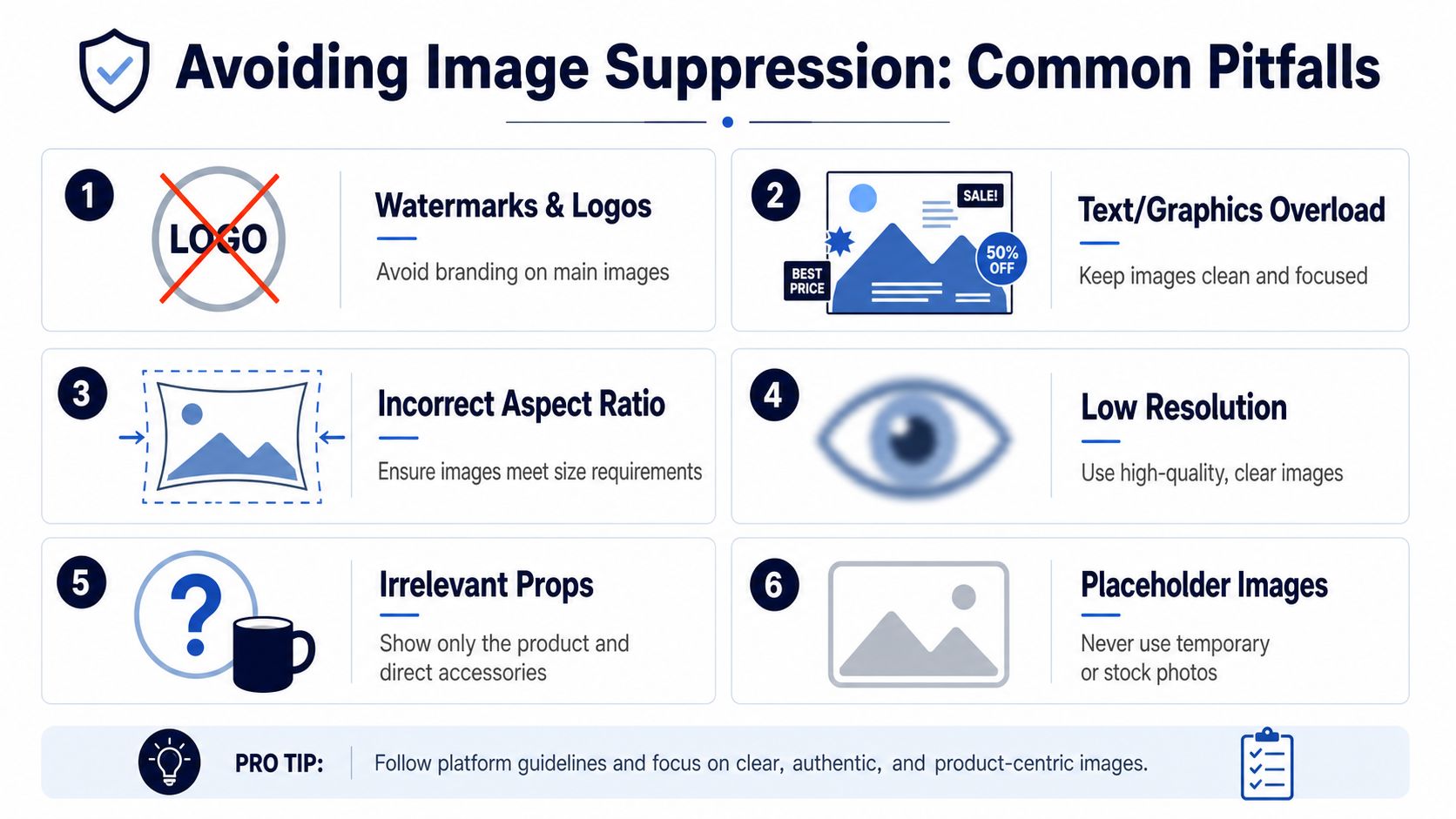
This is a classic agency and in-house design error. The background looks white on screen, but the exported file isn't exact white. Corners need pixel verification, not visual guesswork.
Designers often leave too much negative space because the composition feels cleaner. Amazon doesn't care about gallery aesthetics in the main image. The product needs visual dominance.
Badges, tiny icons, faint logos, soft shadows that turn into background contamination, inset accessories, or styled props can all create compliance risk. Sellers add these to “stand out,” then wonder why the listing drops out of normal visibility.
Suppression doesn't always arrive as a dramatic account event. Sometimes the listing just stops behaving normally. Impressions soften. Search placement weakens. A variation stops showing correctly. Teams then chase bids, coupons, and copy, when the actual issue is image compliance.
Many expensive Amazon problems start as tiny production shortcuts. A rushed crop, a mislabeled file, a designer export that no one checked at pixel level.
Before upload, have someone on the team check the main image in three ways:
That last point is where a lot of catalog mistakes begin. If the image implies included accessories, bundled units, or a format that the offer doesn't match, you invite both compliance and conversion problems. Amazon's bots may catch the technical mismatch before your team does.
General Amazon rules get you close, but category rules decide whether “close” is acceptable. Here, sellers make avoidable mistakes by copying a workflow from one catalog segment into another.
Some categories allow visual treatment that would fail elsewhere. Others are stricter about what must be shown and how it's framed. The safest approach is to start with the universal baseline, then adjust only where the category requires it.
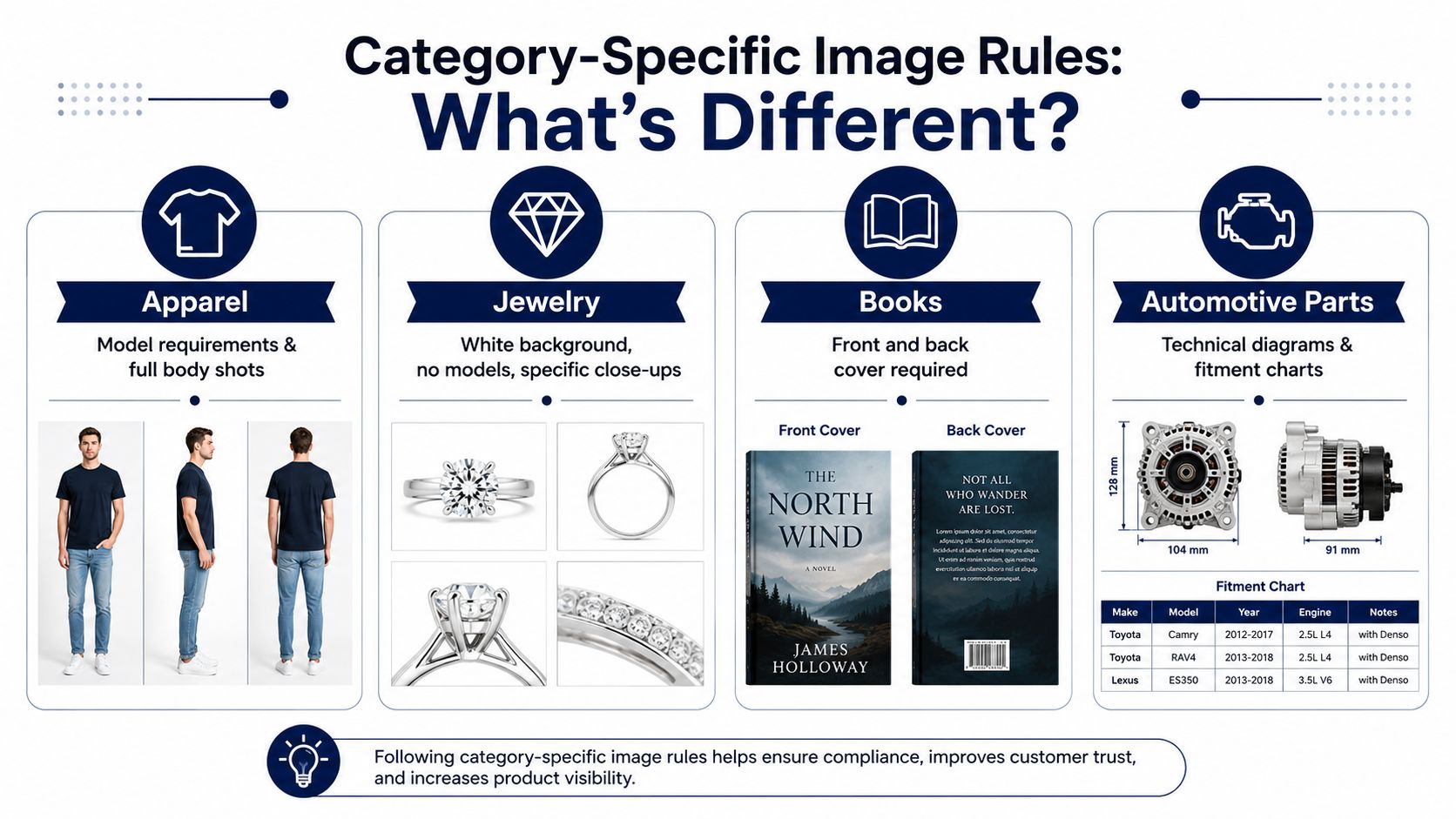
Jewelry gets a notable exception on frame behavior. The standard 85% fill rule applies universally to non-jewelry categories, while jewelry items may touch the frame edge, as noted in the earlier discussion of Amazon's baseline image rules. That sounds minor, but it changes how you crop small, highly detailed items.
For jewelry, the risk is under-presenting the item. Tiny subjects need aggressive framing and careful lighting to avoid looking insignificant in search.
Apparel usually demands context more than hard goods do. Buyers need to understand drape, fit, silhouette, and use. A flat product shot rarely answers enough questions by itself. That makes secondary imagery more important, especially for showing how the product sits on the body and how material behaves in real conditions.
These products rely more heavily on accuracy of the cover and edition presentation. Decorative experimentation usually hurts more than it helps. Buyers want immediate recognition.
A supplement bottle, a necklace, a hoodie, and a repair part don't deserve the same image logic. The goal stays the same. Reduce uncertainty fast. The way you do that changes by category.
For automotive or technical products, clarity around fitment, parts included, and orientation matters. For books, recognizability matters. For apparel, visual context and scale matter. For jewelry, detail and crop control matter.
The mistake is assuming “Amazon-compliant” means “category-optimized.” It doesn't. Sellers who understand image requirements for Amazon at the category level usually produce cleaner listings because they stop trying to solve every PDP with one generic photography template.
A strong image workflow ends with a checklist, not a gut check. Teams that skip this usually pay for it later through suppressed listings, poor conversion, or catalog cleanup.
One issue deserves special attention: multi-pack mismatches. A 2025 analysis of 12,000 suppressed listings found that 41% were caused by multi-pack image and title mismatches, where the title shows one quantity and the main image shows another, triggering suppression without warning, according to this review of Amazon image policy troubleshooting.
Run these before every upload:
Even experienced teams still get burned.
The fastest way to lose a healthy listing is to let catalog data and image data drift apart.
Use a practical merchandising pass:
Finish with operations, not design:
This checklist sounds basic until you scale. Then it becomes one of the cleanest ways to protect revenue, preserve listing continuity, and keep image requirements for Amazon from turning into recurring operational debt.
Serious sellers don't need more generic advice. They need peer-tested execution standards. Million Dollar Sellers connects proven e-commerce founders and operators who share the kind of practical Amazon insight that protects margin, sharpens decision-making, and helps brands scale with fewer expensive mistakes.
Join the Ecom Entrepreneur Community for Vetted 7-9 Figure Ecommerce Founders
Learn MoreYou may also like:
Learn more about our special events!
Check Events