


Stay Updated with Everything about MDS
Thank you! Your submission has been received!
Oops! Something went wrong while submitting the form.
Chilat Doina
October 28, 2025
Let's be honest, trying to run an e-commerce business by digging through endless spreadsheets is like trying to drive a car by looking in the rearview mirror. You see where you've been, but you have no clue where you're going.
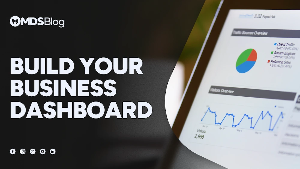
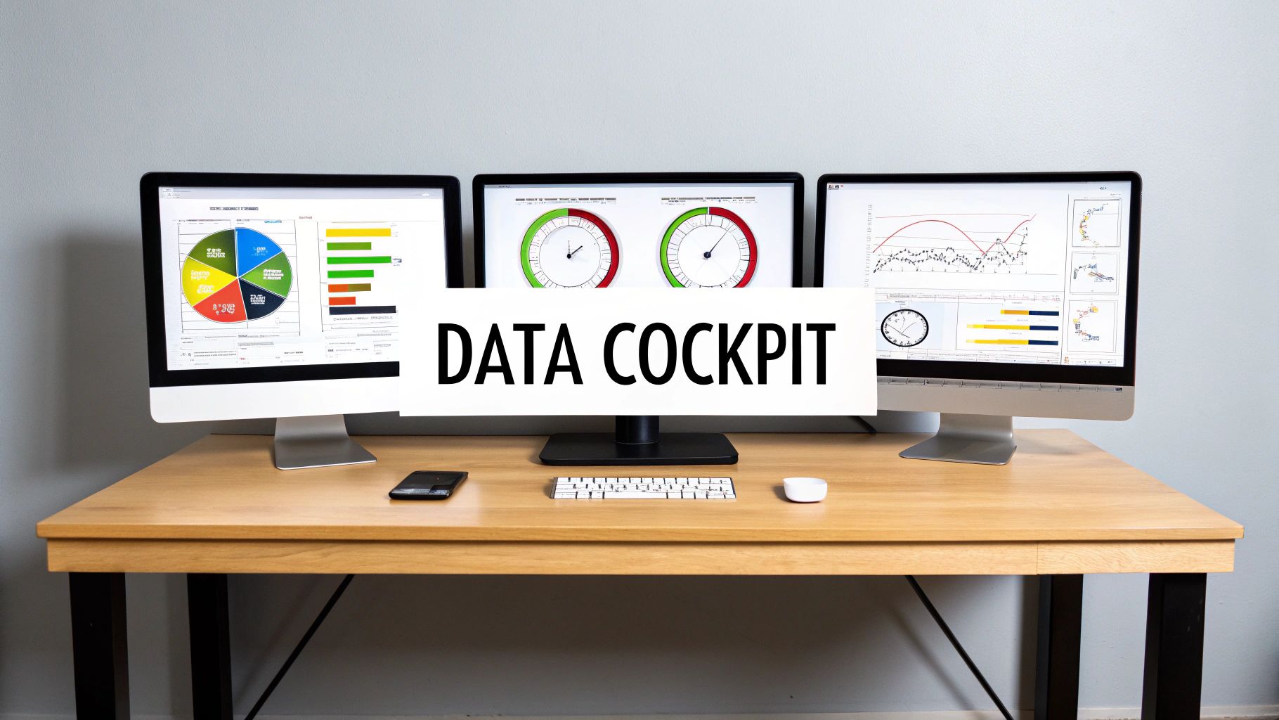
This is where a performance metrics dashboard comes in. It’s your command center, a single screen that pulls all your most important business data into one place, giving you a real-time, at-a-glance view of what's happening right now.
Think of your dashboard as the cockpit of an airplane. A pilot doesn't have time to flip through a hundred different manuals to check on fuel, altitude, and engine status. All that critical information is displayed right in front of them, unified and easy to understand, so they can make smart decisions in seconds.
That's exactly what a good dashboard does for your business. It connects the dots between your sales platforms, marketing campaigns, and operational tools, turning a confusing mess of raw data into a clear picture of your company's health. You can spot opportunities, fix problems before they get out of hand, and steer your business toward its goals with confidence.
The real magic of a performance metrics dashboard is its ability to tell a story with your data. It takes numbers living in separate silos—your CRM, Shopify, Google Ads—and brings them together to answer the questions that actually matter.
For instance, you might see a big spike in website traffic. Is that good? On its own, who knows. But a dashboard shows you that traffic spike right next to your conversion rates and revenue. Suddenly, you have a clear answer: "Yes, that new ad campaign is working," or "No, we're getting a lot of clicks but no sales—we need to fix the landing page."
This shift from just having numbers to actually understanding them is why these tools are exploding in popularity. The global market for real-time dashboards was around $12 billion in 2023 and is expected to rocket to $32 billion by 2032.
A powerful dashboard isn't just a random collection of charts. It’s built from a few key components that work together to bring you clarity.
To make these concepts even clearer, here’s a quick breakdown:
ComponentPurposeReal-World AnalogyKPIsTo track progress against specific, crucial business goals.The speedometer and fuel gauge in your car.Data VisualizationTo make complex data easy and quick to understand.A weather map showing a storm approaching.Real-Time DataTo provide up-to-the-minute information for proactive decisions.A live stock ticker showing market changes as they happen.
These pieces come together to create a tool that guides your focus.
A well-designed dashboard doesn't just present data; it guides your attention to what matters most. It separates the signal from the noise, empowering you to focus on actions that drive results.
Ultimately, a dashboard gives you the clear-eyed view you need to effectively measure digital marketing success and build a business that lasts.
Ever had that sinking feeling where one part of your business is celebrating a win, while another is putting out fires? Your marketing team might be popping the champagne over a huge spike in website traffic, completely unaware that the sales team is staring at an empty pipeline.
This kind of disconnect is maddeningly common, and it almost always boils down to one thing: data silos. When your key business metrics are scattered across different platforms and spreadsheets, each team is flying blind. A centralized performance metrics dashboard is the cure. It smashes down those walls and creates a single, reliable source of truth for everyone.
Without that unified view, you get departments chasing their own goals, sometimes at the expense of the company. Marketing might push for cheap clicks, not realizing the traffic is low-quality and never converts. Operations might switch to a cheaper shipping option to save a few bucks, missing the immediate surge in angry customer reviews and abandoned carts. Everyone thinks they're winning, but the business as a whole is losing.
A central dashboard doesn't just collect your data; it connects it. It lays everything out side-by-side—sales, marketing, inventory, customer service—and suddenly, you start seeing the cause-and-effect relationships that truly drive growth. Insights that were once buried in spreadsheets jump right off the screen.
This unified approach lets you:
A centralized dashboard turns a jumble of isolated facts into a clear story about your business. It's the difference between reading a random page and finally understanding the whole plot.
This shift is non-negotiable if you want to scale an e-commerce brand. It moves you from a culture of guesswork and gut feelings to one powered by hard numbers. To really get a handle on this, it's worth exploring the fundamentals of data-driven decision-making.
Let’s make this real. An online clothing store was having a great month until, out of nowhere, they saw a shocking 25% drop in daily sales. The panic button was about to be pushed.
Instead of scrambling, they pulled up their performance metrics dashboard and started connecting the dots.
They knew exactly where to look next. The dashboard showed the spike started the moment a new promo campaign went live. A quick test of the checkout process revealed the villain: a bug in the new coupon code was causing an error, making it impossible for customers to pay.
Without that central dashboard, it could have taken days of back-and-forth emails and clunky spreadsheet analysis to find the source of the bleeding. Instead, they diagnosed the problem in under an hour, fixed the code, and saved thousands in lost sales. That’s the power of having a single, unified view of your business.
A cluttered dashboard is worse than no dashboard at all. Staring at a screen packed with “vanity metrics”—like total page views or social media followers—is like having a car dashboard that only tells you how clean the paint is. Sure, it looks nice, but it won't help you get where you're going or avoid a crash.
The real power of a performance metrics dashboard comes from picking Key Performance Indicators (KPIs) that are directly wired to your business goals. These are the numbers that track genuine progress, not just random activity. They answer the one question that truly matters: "Are we winning?"
It’s crucial to understand the difference between a simple metric and a real KPI. A metric just tracks a process, but a KPI tells you how well you’re performing. For instance, website traffic is a metric. But the lead-to-customer conversion rate from that traffic? That's a KPI. It measures how effective your entire marketing and sales engine actually is.
If you want a dashboard that helps you make smart decisions, you have to be ruthless about what you include. Every single chart should help you make a better choice. The first step is cutting through the noise and zeroing in on metrics with a direct line to your revenue and profit.
For any e-commerce business, this means getting past the surface-level fluff. Don't just track website visitors; track your Customer Acquisition Cost (CAC). That number tells you exactly how much you're spending to land each new paying customer—a piece of information you can actually do something with.
This infographic shows perfectly how a good dashboard pulls everything together. It acts as a central hub where data from marketing, sales, and operations all meet, letting you track how everything connects.
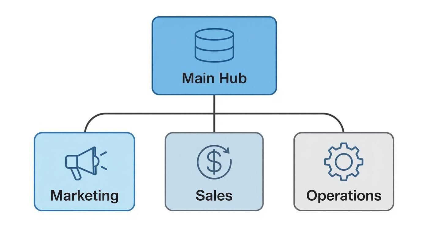
This kind of connected view is what breaks down the silos between departments. You can finally see the whole picture, from the first marketing touchpoint all the way to the final sale.
More and more businesses are catching on. The number of companies tracking five or more KPIs is expected to jump from 22% in 2015 to 63% by 2025. This isn't just a small shift; it's a massive move toward smarter, more detailed performance tracking.
For an online store, your dashboard needs to give you a crystal-clear snapshot of your financial health, what your customers are doing, and whether your marketing is working.
Here’s a quick look at some of the most critical KPIs that every e-commerce dashboard should have. They provide a balanced view across different areas of the business, helping you answer the big-picture questions needed for growth.
KPI CategoryExample MetricWhat It MeasuresStrategic Question It AnswersCustomer ValueCustomer Lifetime Value (CLV)The total revenue a single customer generates over time.Are we building long-term relationships and maximizing customer worth?Sales FunnelCart Abandonment RateThe percentage of shoppers who add items to their cart but don't check out.Is our checkout process broken, or are there hidden costs turning people away?Purchasing BehaviorAverage Order Value (AOV)The average dollar amount spent each time a customer places an order.How can we encourage customers to buy more in each transaction?Marketing EfficiencyCost Per Acquisition (CPA)The total marketing cost to acquire one new paying customer.Is our ad spend actually profitable on a per-customer basis?Lead QualityLead-to-Customer Conversion RateThe percentage of marketing leads that become paying customers.Are we attracting the right audience, and is our sales process effective?
Each of these KPIs tells a story. A rising CLV means your retention efforts are paying off. A high cart abandonment rate is a flashing red light signaling a problem in your checkout flow. They aren’t just numbers; they’re signposts telling you where to focus your attention.
A great KPI doesn't just tell you what happened; it tells you where to look. A sudden spike in cart abandonment is a direct signal to investigate your checkout flow immediately.
Your marketing and sales teams need KPIs that prove their efforts are making money, not just making noise. The best metrics connect campaign spending directly to revenue. For an even deeper dive, check out these Top Metrics for Ecommerce Success.
Here are a couple of must-haves:
When you focus on these kinds of actionable KPIs, your performance metrics dashboard stops being a passive report and becomes an active playbook for growth. If you're ready to really dig into your numbers, our guide on how to analyze sales data offers practical steps to turn raw data into a winning strategy.
A great performance metrics dashboard isn't an art project—it's a communication tool. The whole point is to create a visual so clean and intuitive that anyone, from the CEO to a new marketing hire, can glance at it and get the story of your business in under 30 seconds. This is all about cognitive efficiency, not just pretty charts.

Smart design is what turns a confusing mess of numbers into a clear path forward. It guides your eye, spotlights what really matters, and makes it impossible to miss the big trends. A poorly designed dashboard, on the other hand, just adds to the noise and leads straight to analysis paralysis.
When you first look at a dashboard, your eyes should snap to the most important information first. You achieve this with a strong visual hierarchy, using size, placement, and color to signal what's most critical.
Think of it like the front page of a newspaper. The biggest, boldest headline is always the top story. Your dashboard should work the same way. Stick your most important KPI—like Total Revenue or Customer Acquisition Cost—in the top-left corner, since that's where our eyes naturally start. Make that number bigger and punchier than anything else on the screen.
From there, your secondary metrics can be smaller and placed below or to the right. This creates a natural flow, guiding the user from the big-picture summary down into the nitty-gritty details.
Using the wrong chart is like trying to hammer in a nail with a screwdriver. You might get it done eventually, but it's going to be messy and inefficient. Every type of visualization has a specific job, and picking the right one is crucial for clarity.
The purpose of a chart isn't just to display data; it's to reveal insights. A simple line chart showing a sudden dip in sales tells a much more urgent story than a raw table of numbers ever could.
By matching the chart to the story your data is telling, you make your performance metrics dashboard immediately understandable. This isn't about making things look good; it's about making them clear.
Color is one of the most powerful tools you have in dashboard design, but it's also the easiest to mess up. You want to avoid that "rainbow vomit" look where every chart has its own loud color scheme. Instead, be intentional. Use color to communicate meaning.
A solid approach is to use a neutral palette for most of your charts—think shades of grey or blue—and then save your bright, attention-grabbing colors for a specific reason.
This simple system creates instant visual cues. When someone glances at the dashboard and sees a flash of red, they immediately know something needs their attention, even before they've read the label. This intentional use of color turns a passive report into an active monitoring system, helping your team spot problems and jump on them faster.
Going from theory to a working dashboard sounds like a massive leap, but it’s more achievable than you might think. Building your first performance metrics dashboard is really just a logical process of connecting your data dots and picking the right canvas to paint your business story. The goal isn’t perfection on day one; it's about getting immediate value.

This guide will demystify the tech side of things and show you how to create a simple yet powerful tool that starts delivering insights right away. Let’s break it down into clear, actionable stages.
Before you can visualize a single thing, you need to gather your raw materials. Your business data probably lives in a few different places, and each one holds a crucial piece of the puzzle. The first task is simply to map out these primary sources and make sure you can tap into them.
For a typical e-commerce brand, your go-to sources will almost always include:
The good news? Most modern dashboard tools come with built-in connectors that make linking these sources a breeze, often just needing a simple login to get everything talking.
With your data sources lined up, the next move is picking the platform to bring it all together. The market is flooded with options, but they generally fall into a few practical tiers. You don’t need the most expensive or complicated tool to get started; you just need the one that fits your current needs and technical comfort level.
Here’s a quick rundown of some popular choices:
Tool TierExample ToolsBest ForKey StrengthsFree & AccessibleGoogle Looker StudioStartups and small businesses looking for powerful, no-cost visualization.Native integration with Google products (Analytics, Ads, Sheets) and a user-friendly drag-and-drop interface.Mid-Tier & ScalableDatabox, GeckoboardGrowing businesses needing more pre-built templates and broader integrations.Quick setup with dozens of one-click integrations for popular marketing and sales tools.Advanced & EnterpriseTableau, Microsoft Power BIData-heavy organizations with complex analysis needs and dedicated analysts.Unmatched customization, deep data-blending capabilities, and advanced statistical analysis.
My advice? Start simple. A tool like Google Looker Studio is more than capable of building a robust and insightful performance metrics dashboard for most e-commerce businesses.
The best dashboard tool is the one you'll actually use. Don't get bogged down by feature lists; prioritize ease of use and quick setup to get your data visualized and working for you as soon as possible.
This is where the magic happens and your dashboard actually comes to life. Start with the handful of KPIs you decided were most critical. Don't try to boil the ocean and build everything at once. Begin with a single "executive summary" view that answers the most pressing questions about your business's health.
A great starting point includes:
As businesses rely more on new tech, the need to track ROI becomes non-negotiable. For instance, by 2025, an estimated 78% of organizations will use AI in some capacity, yet a staggering 74% of companies struggle to see real value from it. A well-built dashboard is your best bet for measuring the actual impact of these kinds of investments.
Once you have a handle on these basics, you can move from scattered data to a clear, actionable command center. For a deeper look into how to leverage this kind of data, explore our guide on how to scale insights and drive sales with AI and advanced analytics.
Even with the best game plan, a few questions always pop up when you're getting your hands dirty with a new tool. Let’s tackle some of the most common ones I hear about building and using a performance metrics dashboard.
This really boils down to your role and what you're tracking. If you’re in an operational role, like a marketing manager running a new ad campaign, you should be in there daily. You need to be ready to make quick pivots. For someone in a leadership position, a weekly check-in is usually perfect for spotting high-level trends without getting bogged down in the day-to-day noise.
The most important thing is to make it a habit. Treat it like your Monday morning coffee—a non-negotiable routine that keeps you tapped into the pulse of your business. The last thing you want is for it to become a tool you only open when you suspect something has gone wrong.
A performance metrics dashboard is a proactive tool, not a reactive one. Regular check-ins help you spot opportunities and prevent problems, while infrequent glances only allow you to confirm disasters after they've already happened.
This simple habit is what separates data-informed businesses from those just collecting dust on their data.
Absolutely, and it's one of the biggest mistakes people make. We call it "data overload." When a dashboard is crammed with dozens of charts and metrics, it just becomes noise. You lose the ability to see what actually matters. The whole point is to find clarity, not just dump every piece of data you have onto one screen.
A good rule of thumb is "one screen, one story." Your main dashboard should tell the most important story about your business's health in a single glance. If you need more detail, you can always build out separate, more focused dashboards for different teams or projects. For example:
This approach keeps every view focused and, more importantly, actionable. Remember, a great performance metrics dashboard is defined as much by the data it leaves out as by the data it includes.
Building the dashboard is only half the job. Getting people to actually use it is the other—and often harder—half. The single best way to get your team on board is to build it with them, not just for them. Pull in key people from each department during the planning phase. Ask them what metrics they need to see to do their jobs better. When they have a say in what goes into it, they'll have a reason to use it.
Next, weave the dashboard into your team's regular routines. Make it the centerpiece of your weekly meetings. Have each department head speak to their numbers directly from the dashboard. Once it becomes the official source of truth for all performance conversations, using it will become second nature.
Ready to join a network of elite e-commerce founders who use data to dominate their markets? Million Dollar Sellers is an exclusive, invite-only community where top entrepreneurs share the strategies that drive 8- and 9-figure growth. Apply for your invitation and start scaling smarter at https://milliondollarsellers.com.
Join the Ecom Entrepreneur Community for Vetted 7-9 Figure Ecommerce Founders
Learn MoreYou may also like:
Learn more about our special events!
Check Events.svg)
.svg)
.svg)

.svg)