Chilat Doina
October 13, 2026
Most advice about usability testing starts with the wrong question: How many users should we test? Ecommerce operators should start with a harder question: Where is the store losing money because shoppers can't complete a high-value task?
A usability test isn't a research ritual, a quarterly presentation, or a polite way to collect opinions about button colors. It's a revenue diagnostic. You put a representative shopper in front of a product page, mobile menu, variant selector, cart, checkout, or returns flow, then watch where intent turns into hesitation, error, or abandonment.
The best teams test before they increase traffic. They find the silent leaks that analytics can identify but not explain, then fix the experience before paying to send more shoppers into it. This guide shows how to conduct usability testing as an operating process, with clear decisions about goals, participants, moderation, analysis, accessibility, and AI.
Usability testing isn't a luxury reserved for large product teams. It's one of the most direct ways to find revenue friction before you amplify it with paid acquisition.
Your analytics can show that shoppers leave during checkout. They can't reliably tell you whether shoppers missed the delivery estimate, misunderstood a payment field, rejected a guest checkout option, or couldn't recover from an error. An A/B test can tell you that one version performs better. It usually won't show the moment a shopper loses confidence or the mental model that caused the failure.
A live session does.
Operating rule: Don't buy more traffic until you know representative shoppers can complete the purchase path without unnecessary confusion.
A product detail page can look polished to the team that built it while hiding problems that only appear on mobile. A size selector may use labels that make sense internally but not to a first-time buyer. A returns policy may technically exist while remaining invisible at the exact moment a shopper needs reassurance. These are not abstract UX concerns. They're points where purchase intent can disappear.
Usability testing also exposes problems that conversion reporting compresses into a single outcome. A shopper who eventually completes checkout after several errors may count as a conversion, but the experience still consumed time, confidence, and goodwill. That friction can surface later through support contacts, refunds, or reluctance to buy again.
Treat the work as a recurring diagnostic, not a one-time redesign exercise. Run small rounds around a specific funnel risk, fix the highest-impact issue, and test the revised flow. The cost is easier to justify when the output is a prioritized list of conversion leaks rather than a research report.
For a practical companion to broader conversion work, review this guide to improving conversion rates. The core mental model is simple: clarity is an acquisition multiplier. Every dollar spent removing confusion from a high-intent journey is often better deployed than another dollar sending confused shoppers into the same journey.
Vague goals create vague findings. “Test the website” gives a moderator too much room and gives the team no decision to make afterward.
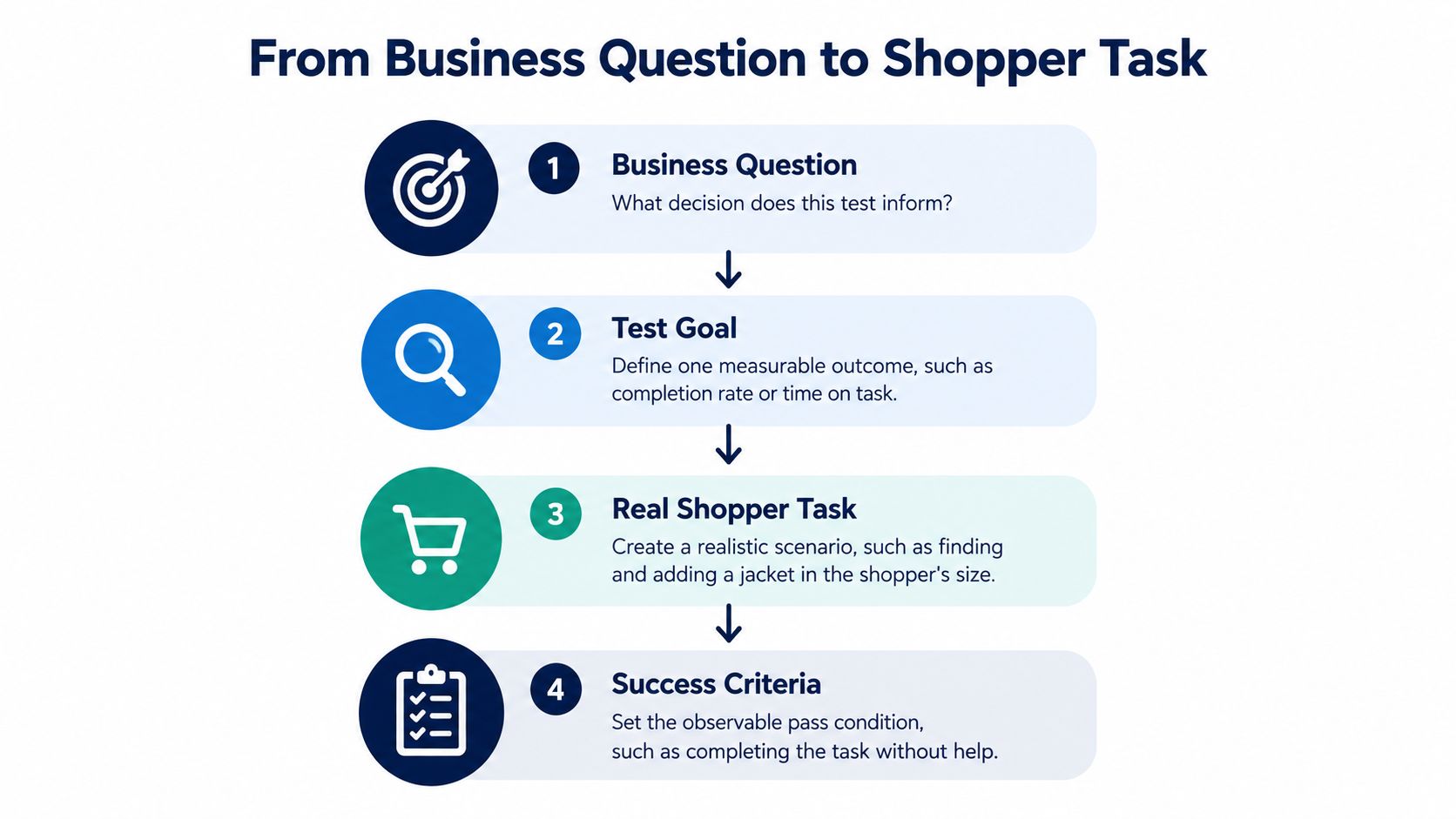
Start with one business question:
Turn that question into a measurable goal. For example: determine whether first-time mobile shoppers can find a product, select the right variant, and add it to cart without a critical error. Under ISO 9241-11, usability should be evaluated through effectiveness, efficiency, and satisfaction, with the users, goals, and context defined in advance. The ISO 9241-11 guidance gives you the structure for connecting those observations to business outcomes.
A strong task gives the participant a reason to act without revealing the interface path. Use this template:
You are [shopper context]. You need to [realistic goal] because [credible motivation]. Starting from [starting point], show us how you would [observable action]. Tell us when you believe you've completed the task.
Examples:
Don't write, “Click the menu, choose jackets, select medium, and open delivery information.” That script tests whether the participant can follow your instructions, not whether the storefront communicates clearly. Avoid giving away the answer with labels such as “find the returns page” when a shopper would naturally look for “help with an order.”
Before sessions, define the pass condition. It might be successful completion, no critical error, acceptable time or effort, accurate understanding of delivery terms, or confidence in the next step. Record task completion, errors, abandonment, hesitation, confidence, and post-task satisfaction. A useful moderated and unmoderated test script resource can help your moderator keep prompts consistent.
Use a focused voice of customer framework to complement observed behavior, but don't confuse stated preference with usability evidence. What shoppers say they like matters less than what they can complete independently.
Five users is the most repeated number in usability testing, and the most abused. It came from Jakob Nielsen and Thomas Landauer's 1993 probabilistic model, presented at INTERCHI '93 in Amsterdam. Their analysis covered 11 usability studies and estimated that one participant had roughly a 31% chance of uncovering a particular usability problem, which led to an expectation that five representative users could reveal about 85% of detectable issues in one iteration, as documented by Nielsen's usability testing analysis.
That is a useful operating heuristic for a homogeneous audience and a focused formative test. It isn't a universal guarantee.
A 2006 replication study tested 60 users completing the same web-based timesheet task. Random groups of five uncovered between 55% and 99% of the usability problems, while groups of 10 found at least 80% and groups of 20 found at least 95%, according to the replication study. A 2010 meta-study summarized in Communications of the ACM concluded that approximately 10 ± 2 participants could be sufficient for finding 80% of usability problems.
The decision is therefore about risk, not superstition. Test five users when you're diagnosing a narrow problem in one relatively consistent segment. Increase the sample when checkout is commercially critical, behaviors vary, or you need stronger confidence before making a broad storefront change.
| Decision Risk | Recommended Participants | When to Use |
|---|---|---|
| Low | 5 | Early formative testing of one homogeneous audience and one focused flow |
| Moderate | 5, then another 5 | Iterative testing across one segment after fixing the first round |
| High | 10 or more | Checkout, payment, account creation, or another revenue-critical journey |
| Segmented | Separate rounds by segment | Material differences in device, language, accessibility needs, shopping mission, or customer type |
Don't pool first-time shoppers, repeat buyers, mobile-only users, and wholesale customers just to reach a target count. Findings from one group may not generalize to another. The better process is to define the segment, recruit people who match it, test realistic tasks, fix the biggest failures, and run the next round where uncertainty remains.
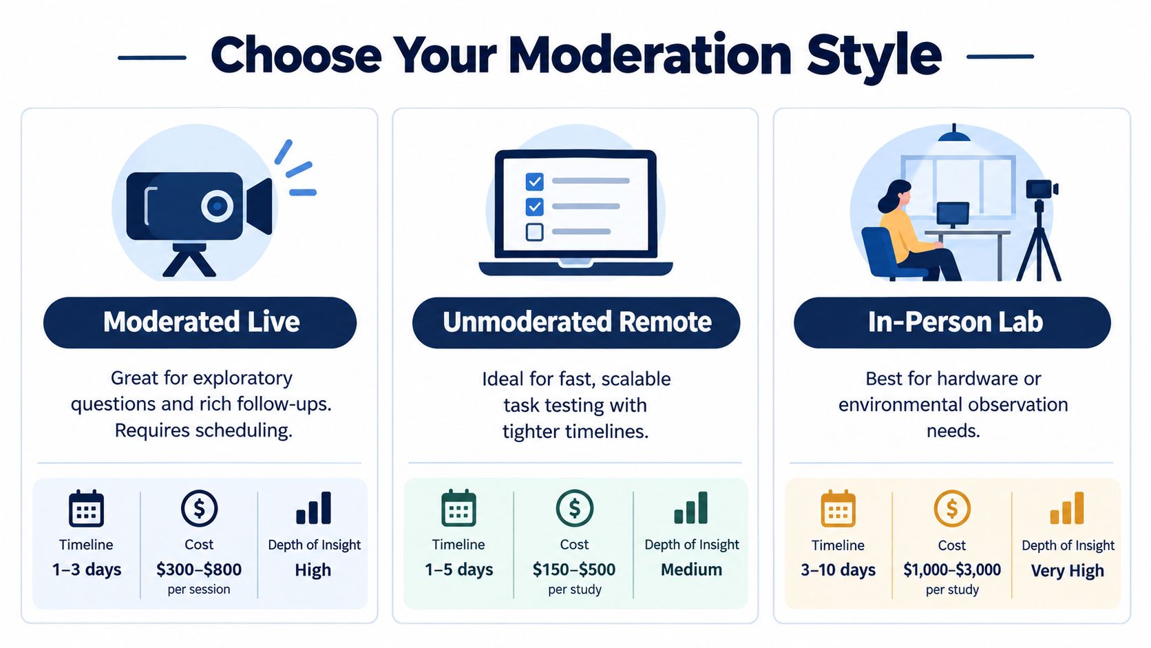
The right method depends on what you need to learn. Moderated sessions are strongest when the question is open, the failure is ambiguous, or you need to ask why a shopper made a particular choice. Unmoderated testing works well when tasks are narrow, the flow is stable, and speed matters more than follow-up depth. In-person work earns its place when the physical environment, device, packaging, or assistive technology is part of the experience.
| Test goal | Best fit | What it reveals | What it hides |
|---|---|---|---|
| Understand unexpected confusion | Moderated remote | Reasoning, hesitation, follow-up context | Natural behavior without an observer |
| Validate a defined task quickly | Unmoderated remote | Completion patterns, errors, recordings across participants | Nuanced causes when the participant gets stuck |
| Study device or environment constraints | In-person lab | Physical interaction, setup, assistive technology, environmental behavior | Everyday context outside the lab |
| Verify a high-risk checkout path | Moderated remote, followed by quantitative validation | Failure causes and language shoppers use | Broad prevalence without more measurement |
Lookback is useful when you want moderated video sessions and straightforward replay. Maze fits prototype and unmoderated task workflows, especially when product teams already work from design files. UserTesting can help teams recruit and review participant sessions at scale. Userlytics offers a similar remote testing approach with moderated and unmoderated options. Choose based on the workflow your team will repeat, not the longest feature list.
A brand running one focused test a month should prioritize simple recruitment, recording, consent, and export. A marketplace shipping changes every sprint may justify deeper integrations, reusable panels, and a consistent repository. Don't buy a research stack that creates more administration than insight.
This short overview gives a useful visual introduction to the mechanics of usability testing:
The familiar five-user model remains useful for rapid diagnosis, but only under the right conditions. Nielsen's model estimated roughly a 31% chance per participant of uncovering a given problem, with five representative users expected to surface about 85% of detectable issues in a focused round. Treat that as a decision aid, not permission to under-test a complex, segmented checkout.
Your job as moderator isn't to make participants feel positive about the store. Your job is to observe whether they can complete the task independently.
Recruit people who recently performed the target behavior. Screen for factors that can change the experience, including Amazon versus direct-to-consumer purchasing habits, subscription use, mobile dependence, category familiarity, and relevant accessibility needs. Participant screening guidance reinforces the importance of matching the sample to the behavior under investigation.
Before the session, verify the prototype or live store, recording permissions, device setup, test accounts, product availability, checkout rules, and fallback plan. Assign one moderator and one note-taker when possible. The moderator protects neutrality. The note-taker captures behavior without interrupting the flow.
Open with a clear explanation: you're testing the experience, not the participant. Tell the shopper that some things may not work and that you won't help immediately. Ask them to say what they're thinking, but don't turn think-aloud into a performance requirement.
When a participant pauses, wait. Silence often reveals the friction you need to see. If they ask, “Should I click this?” respond with, “What would you normally do?” If they remain stuck, let the attempt continue long enough to document the failure, then use a neutral probe such as, “What are you looking for right now?” Don't point at the control or name the answer.
Record the exact action separately from your interpretation:
Don't ask leading questions such as, “Was the checkout button easy to find?” Ask, “What would you do next?” Post-task questions can capture confidence and satisfaction, but behavioral evidence gets priority.
Protect participant data. Explain what you record, where it goes, who can access it, and how sensitive purchase or account information is handled. Run sessions close together so the team can compare patterns while details remain fresh. After each session, write the top observations immediately. By the third session, repeated failures should begin to distinguish themselves from one-off preferences.
A research repository full of observations is not a prioritization system. Analysis becomes valuable when it turns raw behavior into a small set of decisions that product, engineering, merchandising, and growth teams can act on.
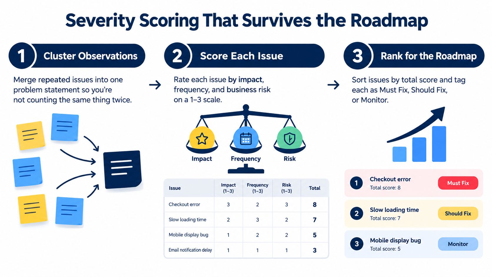
Start by clustering observations into problem statements. “Three shoppers hesitated” is not a problem statement. “Shoppers couldn't tell whether the delivery date applied to the selected variant” is closer. Merge duplicate observations, preserve the evidence, and connect each issue to a funnel stage.
Use a simple 1 to 3 score for each dimension:
Add the scores, then tag the issue as Must Fix, Should Fix, or Monitor. The arithmetic isn't a scientific truth. It forces the team to discuss impact, recurrence, and commercial consequences using the same language.
A useful analysis sheet includes:
| Issue | Funnel stage | Evidence | Impact | Frequency | Business risk | Total | Owner | Next action |
|---|---|---|---|---|---|---|---|---|
| Delivery information unclear | Product page | Shopper searched in page content | 2 | 3 | 3 | 8 | Ecommerce | Clarify placement and wording |
| Guest checkout hard to find | Checkout | Shopper looked for account creation | 3 | 2 | 3 | 8 | Product | Test alternate entry points |
| Filter label preference | Category page | Shopper chose a different term | 1 | 1 | 1 | 3 | Merchandising | Monitor |
Don't turn every preference into a roadmap item. A shopper preferring a different color isn't equivalent to a shopper being unable to complete payment. Separate blockers, errors, excess effort, and subjective preferences.
Map each Must Fix issue to a measurable outcome. Effectiveness connects to task completion and funnel progression. Efficiency connects to time, errors, and effort. Satisfaction connects to confidence and acceptability. Then assign each item to a near-term fix, a larger redesign, or a later research question. Retest after implementation, especially when the change affects checkout, product selection, accessibility, or payment.
AI is useful in usability testing, but not in the way many teams advertise it. It can reduce the time required to organize evidence. It can't assume the responsibility for deciding whether a real shopper failed for a commercially important reason.
Recent research found that GPT-4-generated follow-up questions could refine participant responses, but the system had limited ability to uncover problems beyond the questions already defined. Research also warns that synthetic users can't reproduce complex human behavior reliably and shouldn't replace authentic participants, particularly for marginalized groups, novel products, or unpredictable use cases, as discussed in this analysis of human-centered AI-assisted usability testing.
AI can safely support work where the human team retains the evidence and final judgment:
AI should not own recruitment decisions, live moderation of sensitive sessions, final severity scoring, accessibility interpretation, or approval of a storefront change. It should also never receive participant data without a clear privacy decision. Remove unnecessary personal information, define retention rules, and confirm that the tool's data practices match the consent you obtained.
Teams experimenting with browser agents should understand the difference between an agent that can execute interface actions and a research method that can explain human intent. Clearcote Labs' agent runtime breakdown is useful context for evaluating what an automated browser system can do, and what it still can't infer from a shopper's hesitation.
Every AI-generated finding should pass four checks:
Reject findings that rely on invented participant intent, collapse different segments into one pattern, or describe a visual issue without showing the relevant interface state. A confident summary isn't validation.
Use AI to make AI tools for ecommerce part of the operating workflow, not a substitute for customer contact. The standard should be decision reliability. If an AI-assisted process can't reproduce a real shopper problem or help predict a meaningful improvement in task completion, support demand, or conversion behavior, it hasn't earned authority over the roadmap.
You don't need a large research department to establish the habit. You need one revenue-critical flow, one accountable owner, and a deadline.
Days 1 to 7, choose the leak. Select a single journey such as mobile product selection, guest checkout, delivery reassurance, or returns. Write the business question, success criteria, segment definition, consent language, and task script. The deliverable is a one-page test plan.
Days 8 to 14, recruit and pilot. Recruit participants who match the segment and have recently performed the relevant behavior. Pilot every task with a colleague who wasn't involved in writing it. Remove coaching, repair broken prototypes, and confirm the recording workflow. The checkpoint is a clean session that produces observable evidence.
Days 15 to 21, run and synthesize. Conduct the sessions, record task outcomes, separate observations from interpretations, and use AI only for first-pass organization. Human reviewers should verify every high-impact cluster against source evidence. The deliverable is a severity-ranked issue list.
Days 22 to 30, fix and retest. Ship the smallest change that addresses the highest-risk failure, then test the revised flow with relevant shoppers. Track time-to-fix, task completion, errors, abandonment, confidence, satisfaction, and support contacts per order. Fold unresolved issues into the quarterly roadmap with an owner and a next checkpoint.
The program is working when testing changes what the team ships. It becomes a growth operating system when every major storefront change has a stated user segment, a measurable task, observed evidence, a severity decision, and a retest plan.
Million Dollar Sellers gives serious ecommerce operators access to a trusted peer network, strategy sharing, and execution-focused insights from founders running substantial Amazon, DTC, and omnichannel brands. If you want sharper operating conversations around conversion friction, customer experience, and scalable growth, visit Million Dollar Sellers.
Join the Ecom Entrepreneur Community for Vetted 7-9 Figure Ecommerce Founders
Learn MoreYou may also like:
Learn more about our special events!
Check Events