
Chilat Doina
June 12, 2026
If you're buying more traffic, watching CAC creep up, and still ending the month with the same revenue line, the problem usually isn't awareness. It's throughput. Your funnel is leaking, and paid media is covering it up just enough to keep the machine running.
Most established brands hit this stage. The homepage looks fine. The product pages look polished. The checkout works. Yet conversion stalls, margin gets thinner, and every growth conversation starts drifting toward more discounts, louder promos, and more aggressive retargeting. That's where a lot of brands inadvertently train their customers to wait for the next offer.
The better move is to build a system for how to improve conversion rates without giving away the business in the process. That means reducing friction, clarifying the buying decision, and testing changes that increase completed purchases while protecting brand perception, average order value, and long-term customer behavior.
A lot of founders misread the plateau.
They see flat revenue and assume the answer is more sessions, more spend, more channels. Then they push harder on acquisition and discover the uncomfortable truth. The store wasn't under-visited. It was under-converting.
The benchmark matters here because it gives you a realistic frame. The average ecommerce conversion rate is about 2.35%, while top-performing sites can reach 5% or higher, according to this conversion rate optimization benchmark roundup. Moving from 2.35% to 3.00% is roughly a 27% relative increase in conversions, which means you can create materially more revenue without buying more traffic.
That shift changes how we operate. We stop asking, "How do we squeeze more clicks out of Meta or Google?" and start asking, "Why are ready-to-buy visitors hesitating?"
Practical rule: If paid traffic is getting more expensive, every point of friction in your funnel becomes more costly.
The common mistake is treating CRO like cosmetic design work. New theme. New hero image. New color system. Months of effort, weak causal clarity, no clear learning.
That isn't optimization. That's renovation.
Real CRO is usually more surgical. It's tightening the decision path. Sharper value proposition. Cleaner page hierarchy. Better CTA placement. Fewer distractions. Less checkout anxiety. If you want a broader reference point, this comprehensive guide to ecommerce optimization is useful because it frames optimization as a system rather than a bag of hacks.
Traffic gets rented. Conversion improvements stay.
When we improve a page that already receives meaningful intent, every future click becomes more valuable. That applies whether the session came from paid search, email, Amazon halo traffic, affiliates, or organic. And unlike discounting, conversion gains from reduced friction don't automatically lower perceived value.
A simple way to understand it:
| Focus | What it usually does | What it often costs |
|---|---|---|
| More traffic | Increases top-of-funnel volume | Higher spend and rising CAC |
| More discounting | Can lift short-term orders | Lower margin and weaker price discipline |
| Better conversion | Gets more from existing demand | Requires rigor and testing |
The brands that scale profitably don't just drive demand. They build a store that closes demand efficiently.
Pages are typically audited. We should audit transitions.
The biggest revenue leaks usually sit between steps, not inside isolated screens. Product view to add-to-cart. Cart to checkout start. Checkout start to purchase. Those handoffs tell you where buying intent collapses.
A strong CRO workflow starts by identifying measurable bottlenecks, then building a hypothesis, redesigning, and validating the change with testing, as laid out in this conversion framework for optimization teams. That's the right order. Diagnosis first. Opinions later.
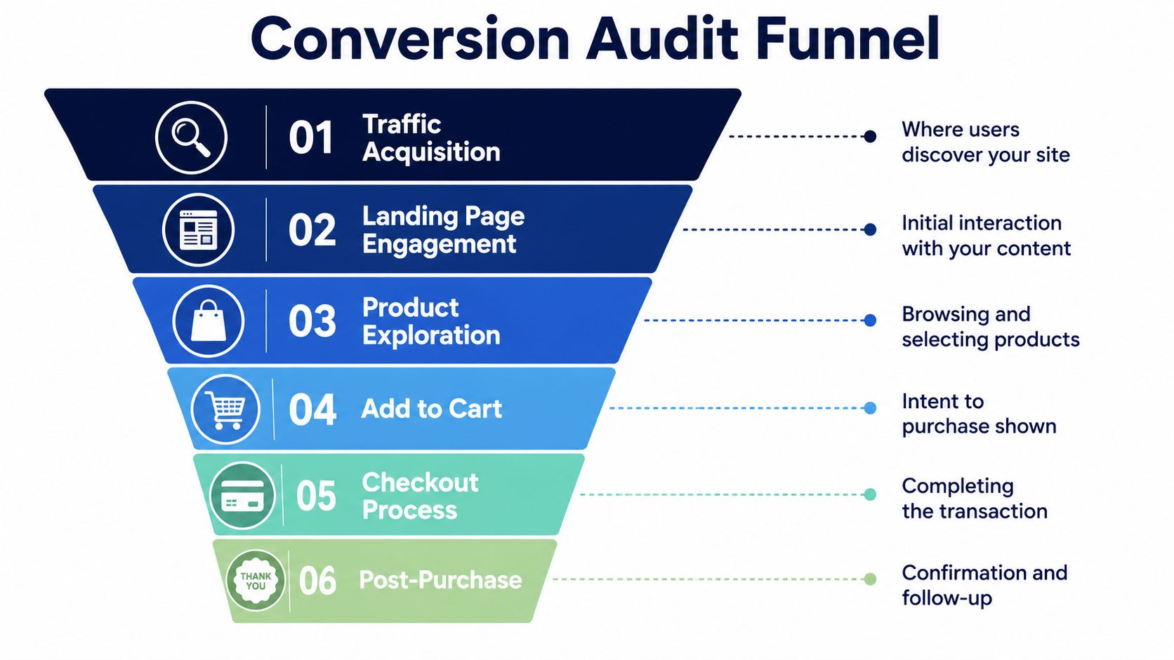
In GA4, build the path you care about. Don't stop at sitewide conversion rate. Break the journey into commercial steps that reflect buying intent.
A useful audit sequence looks like this:
Map the key journey
Product page, cart, checkout start, payment, purchase. For lead gen, use the equivalent handoff sequence.
Segment the funnel
Split by device, traffic source, campaign, landing page type, and new versus returning users.
Locate the largest drop-offs
Not every leak deserves attention. Focus on the steps nearest purchase first.
Validate with behavior tools
Heatmaps and session recordings show whether the issue is confusion, distraction, broken UX, weak messaging, or surprise costs.
The technical side matters, but the reasoning matters more. You want a shared operating habit grounded in analytics, not dashboard theater. If your team needs a refresher on the measurement side, this primer on data analytics for decision-making is a practical place to align terminology.
Quant tells you where the problem is. Qual tells you why buyers don't complete.
When a checkout step underperforms, watch real sessions from users who reached that point and left. You'll usually find one of a few patterns:
Watch abandoned sessions from high-intent users first. A visitor who bounced after two seconds is less useful than a shopper who added to cart and stalled at payment.
For a more process-driven breakdown of this stage, Samuel Woods has a clear resource on how to optimize your conversion funnel. It's helpful when you need a structured lens for where to inspect first.
Use these in reviews with your growth lead, ecommerce manager, or agency:
A real audit ends with a short list of high-friction transitions, not a giant deck of observations nobody ships.
A serious audit gives you more ideas than you can execute. That's good. The danger is treating every issue as equally urgent.
It isn't.
The page with the loudest complaints isn't always the page with the biggest commercial upside. We need a prioritization model that keeps the team focused on changes with the strongest blend of business value, implementation realism, and evidence.
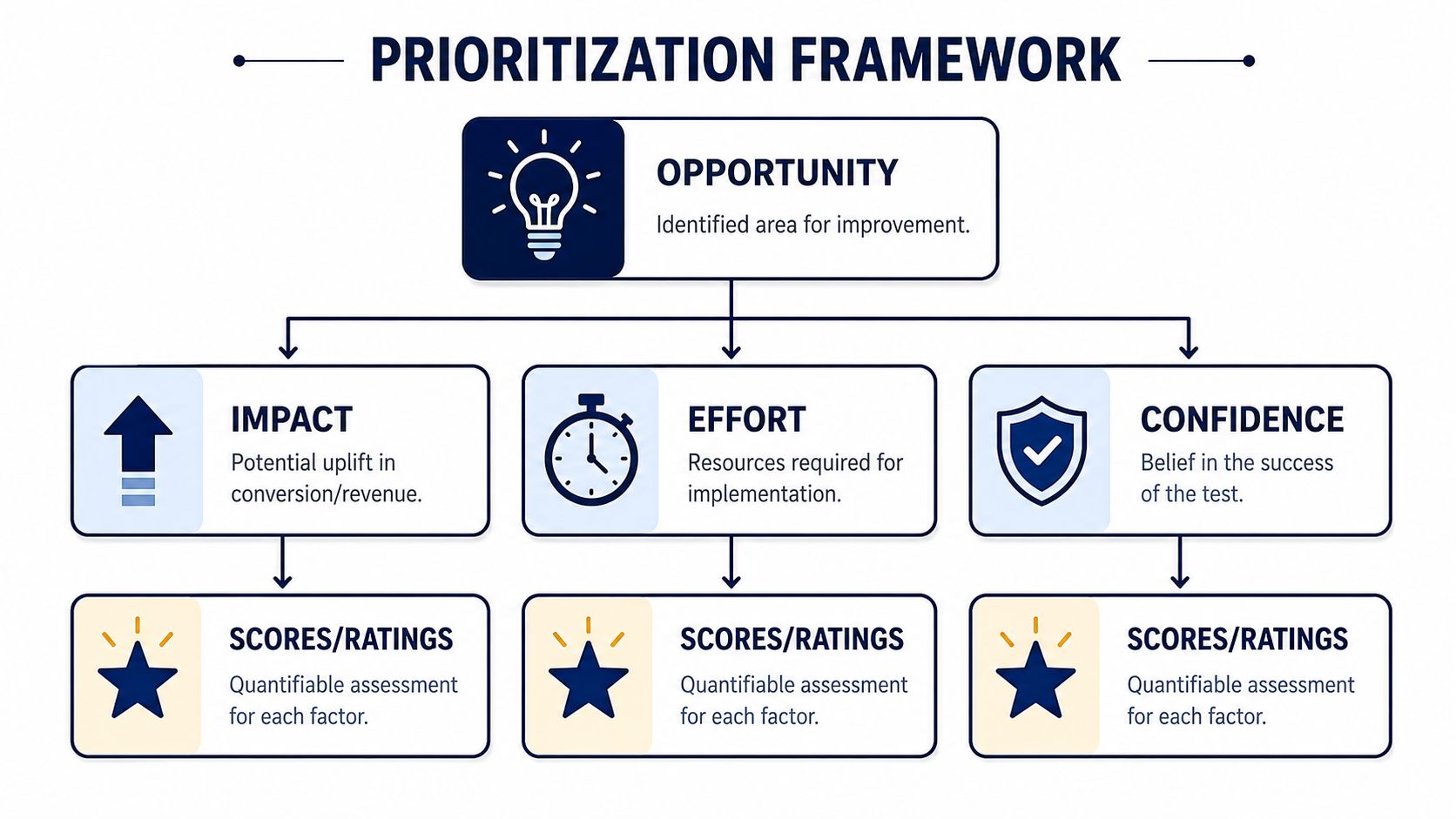
I like keeping this close to the classic impact-effort-confidence logic. Some teams call it PIE, others use ICE. The name matters less than the discipline.
Score each test idea across three dimensions:
| Factor | What you're judging | What high score means |
|---|---|---|
| Impact | Revenue upside if it works | It affects a high-value bottleneck |
| Effort | Design, dev, QA, and ops cost | It can ship without heavy lift |
| Confidence | Strength of evidence behind the idea | Multiple signals point to the same issue |
This prevents the usual waste. Teams love redesigning low-volume pages because they're politically easy. Meanwhile, the checkout step keeps bleeding intent.
Most losing tests fail before launch because the hypothesis was vague.
Bad hypothesis: improve PDP trust signals.
Better hypothesis: add reviews directly adjacent to the primary CTA on the top-selling PDP because buyers are hesitating at the decision point and currently have to scroll to find reassurance.
The point is specificity. One audience. One friction point. One expected mechanism.
A good hypothesis should answer:
Operator note: If a test changes headline, layout, social proof, and CTA hierarchy at once, you may get a result, but you won't get a clean lesson.
The best test queue is rarely balanced across the whole site. It should be lopsided toward commercial choke points.
In practice, these are often the first candidates:
If your leak sits in cart or checkout behavior, this guide on reducing cart abandonment pairs well with your prioritization work because it keeps the focus on buyer hesitation close to purchase.
Some tasks feel productive but belong lower in the queue:
We should treat prioritization like capital allocation. Every dev cycle, every design hour, every test slot should go where intent and friction intersect.
Once the diagnosis is solid, the work gets very practical. The fastest wins usually come from pages where buyers are making a decision, not browsing casually. That means product pages, landing pages, and checkout.
The pattern across these pages is consistent. Reduce noise. Clarify the next step. Increase trust exactly where hesitation shows up.

A PDP has one job. Turn interest into intent.
Too many brands treat it like a digital shelf tag. Nice photos, vague copy, scattered proof, and the actual reason to buy is buried halfway down the page.
A stronger PDP usually does four things above the fold:
States the value fast
Buyers should understand what the product is, who it's for, and why it's worth choosing.
Supports the decision visually
Image galleries should answer practical questions, not just look polished. Show scale, use, details, and texture.
Makes the CTA obvious
One clear action beats a cluster of competing buttons.
Places reassurance near the decision
Trust has to be adjacent to action, not hidden in tabs.
That last point matters. Adding customer reviews can increase conversion rates by as much as 270%, according to guidance cited in this CRO tactics roundup from Quantum Metric. The placement matters as much as the existence. Reviews near the CTA do more work than reviews buried below a long content wall.
When a landing page underperforms, the issue is often abundance. Too many elements. Too many routes. Too many messages competing for attention.
The same Quantum Metric guidance reports that landing pages with fewer than 10 elements can see about double the conversion rates. The takeaway isn't that every page should become minimal by default. It's that buyer attention is limited, and clutter creates hesitation.
A practical before-and-after lens helps:
| Before | After |
|---|---|
| Hero copy that sounds branded but unclear | Headline that matches user intent |
| Multiple competing CTAs | One dominant next step |
| Navigation, banners, popups, promo bars | Reduced exits and cleaner hierarchy |
| Proof hidden lower on page | Trust signals surfaced near the action |
For brands selling considered products, well-deployed support can also remove friction without forcing a discount. Tools like an AI assistant for Shopify stores can help answer product, policy, and fit questions in-session, which is often more margin-friendly than bribing the user to convert.
Buyers rarely need more hype. They need fewer unanswered questions.
Checkout friction kills profitable growth because it wastes the most expensive traffic. By the time a shopper starts checkout, you've already paid to earn that intent.
The most impactful checkout changes are usually operational, not glamorous:
Ask for less
Reducing form friction by asking only for essential information is a proven lever in CRO guidance. Every unnecessary field invites drop-off.
Show progression clearly
Multi-step checkouts need visible progress indicators so buyers know how much effort remains.
Surface total cost early
Shipping and taxes shouldn't appear like a trap at the end. Surprises create exits.
Reinforce trust near payment
Security language, reviews, return policy reminders, and delivery clarity can lower final-step anxiety.
Remove distractions
Checkout is not the place for aggressive upsell chaos, coupon hunting prompts, or unnecessary navigation.
Some tactics look like conversion work but usually weaken the quality of the conversion:
We've all seen stores that convert by shouting. That doesn't mean they convert well. It often means they're borrowing from margin, trust, or future pricing power.
Most brands don't have a testing problem. They have a test design problem.
They run experiments with muddy hypotheses, too many changed variables, and a team hovering over the dashboard after two days looking for permission to declare victory. That's how you end up shipping noise.
A clean A/B test is boring in the right way. One meaningful change. One clear success metric. Enough time to let signal outrun randomness.
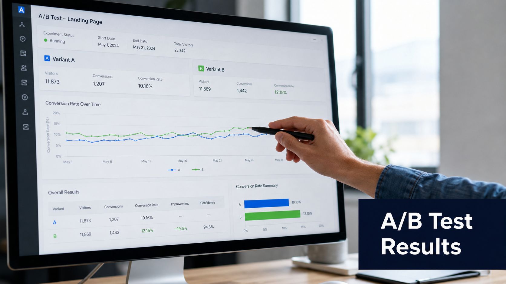
Established CRO guidance is simple here. Split traffic evenly, such as 50% to page A and 50% to page B, so you can isolate which version performs better. That principle is covered in this conversion statistics and testing overview.
That even split only helps if the test itself is disciplined.
Change one thing that has a plausible causal path to the result. Headline. CTA copy. Review placement. Form field reduction. Payment-page reassurance. Not all of them at once.
If your team needs a concise overview of the mechanics, this resource on what A/B testing is and how it works is a straightforward reference.
One test should have one main success condition.
For a PDP test, that may be add-to-cart rate. For checkout, completed purchase. For an email capture page, form completion. Secondary metrics still matter, but they don't get to overrule the test goal because they look flattering in a slide deck.
Use this sanity check before launch:
If the answer to the third question is no, don't run the test.
The right test isn't the one that's easiest to launch. It's the one that resolves the most important uncertainty.
At this stage, teams sabotage themselves.
You see a positive trend, internal excitement rises, and someone wants to call it. But CRO guidance consistently emphasizes running tests long enough to reach statistical significance rather than stopping on early noise. That matters because false winners waste traffic and create bad institutional learning.
A few operational rules help:
For teams that want a visual walkthrough of the process, this short video is a useful companion:
Not every change deserves an experiment.
If the checkout button is broken, fix it. If mobile layout collapses on Safari, fix it. If a trust policy is missing from a high-anxiety step and support tickets keep proving the same objection, you may ship the correction and monitor performance.
Testing is for uncertainty, not obvious defects.
The best operators know the difference between experimentation and maintenance. Both matter. Only one should consume your test queue.
The true test starts after a winner goes live.
A lift on one page is useful. A repeatable system that turns isolated wins into better merchandising, stronger margins, and cleaner customer journeys is what scales. Established brands do not have the luxury of chasing conversion at any cost. We have to protect contribution margin, price integrity, and brand trust while we improve the funnel.
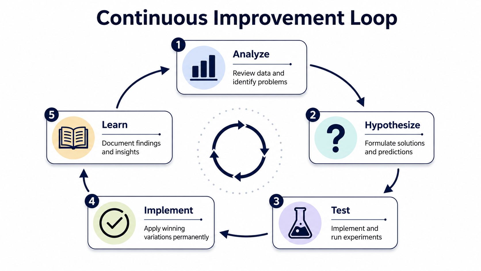
Shipping the variant is only part of the job. The bigger value is understanding why it won.
Document the change, the audience, the page type, the primary metric, and the side effects. Include your read on buyer psychology. If a PDP test wins because it reduces uncertainty around sizing, that insight should shape email creative, ad angles, on-site messaging, and even customer support macros. That is how a single test pays out across the business instead of dying in an experiment log.
A useful post-test record includes:
| Field | What to capture |
|---|---|
| Hypothesis | What you believed and why |
| Change | The exact element modified |
| Primary metric | The outcome used to judge the test |
| Secondary effects | AOV, bounce behavior, support impact, or quality signals |
| Decision | Roll out, reject, or retest with adjustment |
High conversion can still be bad business.
We see this when brands train shoppers to pause until a code appears. Conversion rises for a month, then full-price efficiency weakens, repeat purchase quality drops, and every campaign needs more incentive to hit the same number. That is not CRO. That is margin decay disguised as growth.
Baymard's ecommerce CRO research notes that exposing coupon fields too early can push shoppers to leave checkout and search for a discount code. The better move is usually to remove friction before adding offers, as discussed in this ecommerce CRO research hub.
Use a higher bar for rollout decisions:
A conversion that holds price is usually worth more than one bought with a promo habit.
CRO works best as an operating rhythm, not a side project owned by one person.
Merchandising should bring category friction. CX should surface repeated objections and return reasons. Growth should add traffic context so the team knows whether a result came from the page or from a change in acquisition quality. Product and dev should work from a ranked test queue, not whoever shouted loudest in Slack that week.
That cadence sharpens judgment over time. Teams get faster at spotting bad ideas before they reach production. They also get better at distinguishing a true scaling win from a short-term bump that creates downstream problems in support, fulfillment, or discount dependency.
The practical standard is simple. Every month, the business should know:
Join the Ecom Entrepreneur Community for Vetted 7-9 Figure Ecommerce Founders
Learn MoreYou may also like:
Learn more about our special events!
Check Events