


Stay Updated with Everything about MDS
Thank you! Your submission has been received!
Oops! Something went wrong while submitting the form.

Chilat Doina
September 1, 2025
To really tackle cart abandonment, you have to get rid of surprise costs, make your checkout process ridiculously simple, and build undeniable trust with your customers. A smooth, transparent journey from the product page to that final "thank you" screen is your best weapon against shoppers leaving items behind.
You know that feeling when you see a cart full of products just sitting there? It’s not just a missed sale—it's a direct message from your customers. A high cart abandonment rate isn't a sign of failure. It's actually a powerful feedback loop telling you there's a problem somewhere in your buying process.
The global online shopping cart abandonment rate is a jaw-dropping 70.19%. This number just keeps climbing thanks to fierce competition and shoppers who (rightfully) expect a flawless experience. The biggest culprit? Surprise costs, like unexpected shipping fees and taxes that pop up at the last second. You can dig into the numbers in this in-depth cart abandonment report.
Figuring out the psychology behind why people hesitate is the first real step to fixing it. It's almost never about the product itself. It’s about the process.
People add items to their carts for all sorts of reasons. Some are absolutely ready to buy, but many others are just "window shopping," comparing prices, or saving things for later. The second they click "checkout," their mindset shifts from browsing to committing.
At that critical moment, any little hiccup can trigger instant buyer's remorse before they've even spent a dime.
These friction points usually fall into a few categories:
This is where you can make a huge difference by removing those roadblocks.
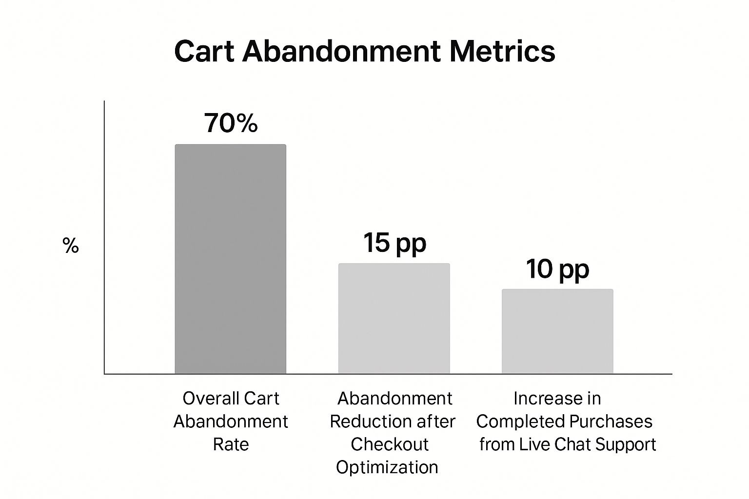
As you can see, making targeted changes like optimizing your checkout flow or offering real-time help can seriously cut down that abandonment rate.
Every abandoned cart tells a story. Maybe a customer on their phone got annoyed with tiny form fields. Or perhaps another shopper was shocked when a $15 shipping fee was tacked onto their $10 item. Each scenario points to a specific, fixable problem in your sales process. Nailing these fixes is a huge part of increasing ecommerce sales effectively.
Don't think of cart abandonment as a lost sale. See it as an opportunity to improve the customer experience. Every abandoned cart gives you data to make the path to purchase smoother for the next person.
To get started, let's look at the usual suspects. This table breaks down the most common reasons shoppers leave and gives you a sneak peek at the solutions we'll dive into throughout this guide. Think of it as your roadmap for diagnosing and fixing the core issues that are hurting your conversions.
This table covers the biggest offenders, but remember, every store is different. The key is to use this as a starting point to identify your specific friction points and start making meaningful improvements.
Before you can plug the holes in your checkout process, you have to find them first. This means putting on your detective hat and digging into the data to see exactly where your customers are jumping ship. Guessing won't get you anywhere; you need to pinpoint the specific friction points that are killing your sales.
It all starts with your analytics. A tool like Google Analytics is your best friend here, letting you visualize the entire customer journey from the moment they add an item to their cart all the way to the final "thank you" page. Your first move should be setting up a checkout behavior analysis or a funnel visualization report.
This isn't just about looking at overall traffic. We're mapping out every single stage of your checkout—from viewing the cart and entering shipping info, to providing payment details and finally hitting "complete order." This map will immediately light up your biggest drop-off points.
The whole point is to get a crystal-clear, data-driven picture of what's happening. A good funnel report takes abstract numbers and turns them into a story about your customer’s path to purchase—or, in this case, their path to abandonment.
Here’s a look at a pretty standard funnel report from Google Analytics. It’s a perfect example of how to spot trouble.

You can see the percentage of users who make it from one step to the next, which instantly reveals the exact pages bleeding the most customers. A huge drop between the shipping and payment steps, for example, is a massive red flag that something is seriously wrong.
Analytics tells you what is happening and where it's happening. If 60% of your users bail after seeing the shipping costs, you’ve just found a major leak. This is your starting point.
Once you have this raw data, the real insights come from segmentation. Is the drop-off rate way higher for mobile users? That could point to a clunky mobile UX, like tiny form fields or a non-responsive design. Does the abandonment rate spike for international shoppers? Maybe your global shipping options are too pricey or just plain confusing.
If you want to go deeper on spotting and fixing these kinds of performance issues, it’s worth checking out these Conversion Rate Optimization Best Practices.
Analytics are great for flagging where the problem is, but they don't tell you why people are leaving. For that, you need to bring in qualitative tools to get the human story behind the numbers.
This is where session recording and heatmap tools are absolute game-changers. They let you watch anonymized recordings of real people trying to use your site.
Session Recorders: Tools like Hotjar or FullStory let you see exactly what users are doing on your checkout page. You can watch them rage-clicking a broken button, getting stuck on a confusing form field, or trying over and over to use a promo code that just won’t work. It’s the closest thing to looking over your customer's shoulder.
Heatmaps: These tools give you a visual aggregate of where people click, move their mouse, and scroll. A heatmap might reveal that no one is even clicking your "Guest Checkout" button because it's buried, or that users are trying to click on things that aren't actually links, signaling a confusing design.
Combine these two, and you get the full picture. Analytics points you to the leaky pipe, and the session recordings show you exactly what's causing the clog. For instance, your funnel report shows a massive drop-off on the payment page. A few session recordings might reveal that the credit card expiration date field is formatted weirdly, causing constant errors and driving people away in frustration. That’s an insight you’d never get from numbers alone.
By pairing the "what" with the "why," you can stop guessing and start implementing precise, effective fixes.
Let’s cut to the chase: unexpected costs are the undisputed champion of conversion killers. We’ve all been there. You see a price, you mentally agree to it, and then suddenly at checkout, it jumps by 20%. It feels like a classic bait-and-switch.
This single issue is the number one reason shoppers ditch their carts. It creates a massive trust deficit at the most critical moment of the entire buying journey.

The solution isn't some complex growth hack; it's a commitment to radical transparency. You have to hunt down and eliminate every single financial surprise long before a customer even thinks about hitting the "Pay Now" button. An informed customer is a confident buyer.
The amount of money left on the table is staggering. Cart abandonment leads to an estimated $260 billion in recoverable lost value every single year. Digging into the data, you’ll find that 48% of shoppers leave a site because of unexpected costs like shipping and taxes. It's the biggest leak in the bucket. For a deeper look, you can explore more cart abandonment statistics to see the full scope of the problem.
The best place to start is by showing estimated costs as soon as you possibly can. Don’t make people wait until the final checkout step to find out what shipping will cost. That information belongs on product pages or, at the very least, clearly displayed in the shopping cart itself.
One of the easiest wins here is a shipping calculator. Let users pop in their zip code right on the cart page to get an instant, accurate estimate. This small feature turns shipping from a nasty surprise into a known variable. It gives the customer control and clarity.
Pro Tip: If you can, show multiple shipping options like Standard, Expedited, and Next-Day. This empowers the customer to choose the right balance of cost and speed for their needs, which reduces friction even further.
This philosophy extends beyond just shipping, of course. Be upfront about anything and everything that could impact the final price.
True transparency is about more than just the numbers on the screen. It's about setting crystal-clear expectations for the entire experience after they click "buy." Ambiguity breeds hesitation, so your job is to answer every potential question before it’s even asked.
Think about these key areas:
When you're upfront with all this information, you change the entire dynamic. You're no longer just a seller trying to close a deal; you're a trusted partner guiding the customer through a smooth, predictable purchase.
To help you audit your own site, I've put together a quick checklist comparing trust-building practices with the stuff that makes people run for the hills.
Take a hard look at your checkout flow. Every bit of ambiguity you remove is a step toward recovering lost sales and building a loyal customer base.
Once you've built that initial layer of trust, the next step is all about making the actual act of buying as easy as possible. Every extra click, every unnecessary form field, and every moment of confusion is a potential exit ramp for your customer. A truly frictionless checkout isn't about flashy bells and whistles; it's about ruthlessly cutting obstacles out of the path to purchase.
The whole point is to make the process so smooth and intuitive that your customer glides right through it without a second thought. This is where meticulous user experience (UX) design pays for itself, turning would-be abandoned carts into real revenue. If your checkout feels like a chore, you're going to lose sales. It's really that simple.
Forcing someone to create a full-blown account before they can give you their money is one of the oldest—and most easily fixed—mistakes in the book. It throws up a mandatory, time-sucking barrier right before the finish line. For a brand new customer, this demand for commitment just feels pushy and frustrating.
Let's be clear: the data shows 22% of shoppers will ditch their cart if they're required to create an account. Offering a guest checkout option isn't a nice-to-have anymore; it's non-negotiable.
Letting users check out as a guest removes this friction entirely. It’s a sign of respect for their time, allowing them to buy on their own terms. You can always—and should—offer them the chance to save their information and create an account after the sale is complete. At that point, it feels like a helpful suggestion, not a demand.
Think of every single form field as a tiny hurdle. One or two are no big deal, but a dozen of them can feel like you're asking them to run an obstacle course just to buy something. Your job is to get rid of as many of these hurdles as you can.
You have to be ruthless here. Do you really need their phone number if all your updates are via email? Is that second address line truly essential for every single customer? Scrutinize every field and make it justify its existence.
Here are a few quick wins to simplify your forms:
These may seem like small tweaks, but they add up to a checkout experience that feels much faster and less intimidating.
Beyond just cutting fields, you can actively help customers fill out the necessary ones faster. Modern checkout tech has some fantastic tools to speed things up and cut down on frustrating typos and errors.
One of the most powerful is address auto-fill. By plugging into a service like the Google Places API, you can let customers start typing their address and simply select the correct one from a dropdown. This doesn't just save time; it dramatically reduces the chance of shipping errors caused by a simple typo.
Another fantastic accelerator is offering social logins. Allowing customers to sign in with their existing Google, Facebook, or Apple accounts can pre-populate their name, email, and sometimes even their address with a single click. It’s a secure and familiar shortcut that gets them through the process in a flash.
Imagine this: a customer has browsed your site, filled their cart, entered all their info, and is ready to pay. The absolute last thing you want is for them to walk away simply because you don't accept their preferred payment method.
Limiting your options to just credit cards is a relic of the past. Today's shoppers expect flexibility and convenience.
By offering a solid suite of payment methods, you're catering to a much wider range of preferences and financial situations, removing one of the final pieces of friction from the puzzle.
For many online stores, the checkout experience on a phone is the ultimate make-or-break moment. In fact, mobile devices see a staggering 75.5% cart abandonment rate, which is over 5% higher than the global average. That gap represents a massive opportunity for stores that get their mobile checkout right. You can dig into more of these eye-opening mobile shopping statistics to see the full picture.
A mobile checkout is not just a shrunken-down version of your desktop site. It has to be designed from the ground up for small screens and clumsy thumbs. That means large, easy-to-tap buttons, a clean single-column layout, and form fields that automatically pull up the right keyboard (like a number pad for the credit card field). Every single element has to be optimized to make checking out on a phone just as seamless as it is on a desktop.
A customer ditching their cart isn't the end of the road. In fact, it's a huge opportunity to re-engage. Your best tool for the job? Their inbox. But you have to be smarter than the generic, robotic "You left something in your cart" message everyone else sends. A well-thought-out, automated email sequence can turn a moment of hesitation into a sale, pulling back revenue that would have otherwise vanished.
This isn't about blasting people with emails. It’s about sending a series of smart, well-timed nudges that remind them of what they liked, squash any potential doubts, and gently guide them back to finish the job.

Timing is everything. Send the right message at the right moment, and you’re being helpful. Send it at the wrong time, and you’re just annoying. From what I’ve seen work, an effective recovery campaign almost always follows a three-part structure, with each email playing a specific role.
The Gentle Nudge (1 Hour Later): This first email is just a friendly tap on the shoulder. The purchase is still fresh in their mind, and it's entirely possible they just got distracted or their browser crashed. Keep the tone helpful, not pushy. Show them a clear picture of what's in their cart, give them a direct link back, and use a subject line like, "Did you forget something?" or "Your items are waiting for you."
The Objection Buster (24 Hours Later): If they didn't come back after the first email, there's probably a bigger reason holding them back. Now’s your chance to tackle those common concerns head-on. Remind them of your value—do you offer free shipping or hassle-free returns? This is a great place to sprinkle in some customer reviews or testimonials to build confidence and reassure them they made a great choice.
The Final Incentive (48-72 Hours Later): This is your last, best shot. If the customer is still on the fence, a small, time-sensitive offer can be the nudge they need. A subject line like "A special offer just for you" gets attention fast. Offering a modest discount, say 10% off, or free shipping can be just enough to overcome any price sensitivity and get them across the finish line.
A well-crafted email recovery series can recover between 3% and 14% of otherwise lost sales. For a high-volume store, that adds up to a significant amount of revenue brought back from the brink with a completely automated system.
Let's be real—your email is useless if it's never opened. The subject line is your one and only chance to stand out in a slammed inbox and earn that click. Forget boring, generic phrases. You need to spark curiosity, create a little urgency, or just show them what's in it for them.
Here are a few formulas that consistently perform well:
Once they open the email, the content needs to do all the work. The design should be clean, on-brand, and focused on a single goal: getting that customer back to their cart. Anything else is just noise.
Here’s a quick checklist for a high-impact recovery email:
Mastering this kind of targeted communication is a fundamental strategy to not only recover sales but also boost ecommerce sales across the board by building stronger customer relationships.
Even with a perfectly tweaked checkout process, you're going to have questions. The ecommerce world shifts fast, and shopper habits change right along with it. Let's dig into some of the most common questions that come up when you’re trying to solve the cart abandonment puzzle.
Everyone wants that magic number, but the truth is, a "good" rate depends entirely on what you sell. While the global average sits at a pretty scary 70%, it's all about context.
A shop selling low-cost, impulse-buy items might get its rate down near 50%. On the other hand, a high-end furniture brand could easily see abandonment over 80% simply because people take a lot longer to pull the trigger on a big purchase.
Instead of getting fixated on a universal number, focus on your own. Figure out your baseline rate, then aim to knock it down by a realistic 10-20% using the strategies we've covered. Those small, consistent wins are what really add up.
Timing is everything here. All the data shows that the sweet spot for that first recovery email is within one hour of abandonment.
At this point, the customer's interest is still fresh. You haven't waited so long they've forgotten about you or already bought from a competitor. Send it too fast—say, in under 10 minutes—and it can feel a little invasive. Wait a whole day, and that initial buying excitement is probably gone.
A simple, effective email sequence that just works follows this cadence:
- Email 1 (After 1 Hour): A gentle, helpful nudge. "Did you forget something?"
- Email 2 (After 24 Hours): Reintroduce the product, maybe with some social proof or answers to common questions.
- Email 3 (After 48-72 Hours): The last chance, often sweetened with a small discount to seal the deal.
They absolutely can be, but only if they’re smart. We’re talking about exit-intent pop-ups that offer real value the second a customer’s cursor heads for the exit. These are triggered when a user moves to hit the back button or close the tab on your cart or checkout page.
The trick is to make the pop-up a helping hand, not another annoying interruption.
Email is still the undisputed champ of cart recovery, but it shouldn't be your only tool. To really boost your recovery rates, you need to meet customers on the channels they actually use.
Look beyond the inbox and layer in these other powerful tactics:
Pulling these strategies together creates a much stronger safety net. It's also a fundamental piece of improving ecommerce customer retention, as you're creating multiple helpful touchpoints that guide shoppers back to completing their purchase.
Ready to connect with a community of elite ecommerce founders who have mastered these strategies and more? The Million Dollar Sellers network is where top entrepreneurs share what's working right now to scale their brands past 7, 8, and 9 figures. Learn more and see if you qualify.
Join the Ecom Entrepreneur Community for Vetted 7-9 Figure Ecommerce Founders
Learn MoreYou may also like:
Learn more about our special events!
Check Events.svg)
.svg)
.svg)

.svg)