
Chilat Doina
May 19, 2026
Most advice on how to improve ecommerce conversion rates is backward. It starts with page-level tactics. Test a headline. Move a button. Add urgency. Swap the hero image.
That's not where most brands are losing money.
The expensive mistakes sit deeper in the funnel. Bad traffic-to-product fit. Weak product detail pages. Hidden shipping costs. Checkout friction. Missing trust. Irrelevant offers. Teams obsess over visible surface changes because they're easy to ship. Meanwhile deeper leaks sit untouched because they require diagnosis, not opinions.
Across major markets, ecommerce conversion rates are usually low. Adobe reports a global ecommerce website conversion rate of 2.58% and says online stores should generally expect 1% to 4%. Adobe also gives the clearest practical example: with 100,000 monthly visitors, moving conversion from 2.0% to 2.5% adds 500 extra orders per month without buying more traffic, according to Adobe's ecommerce conversion benchmarks.
That's why serious operators treat CRO as a profit system, not a design project.
If you run DTC, your main advantage usually comes from merchandising, PDP quality, and checkout simplicity. If you sell on Amazon, your advantage is different. Listing quality, search intent match, review density, A+ Content, and retail readiness do far more work than most sellers admit. Same goal. Different battlefield.
Conversion gains usually come from diagnosis, not ideas. If your team is still debating button colors before it can point to the biggest leak in the funnel, you have a prioritization problem.
Start by forcing the business into a simple question: where does qualified intent break?
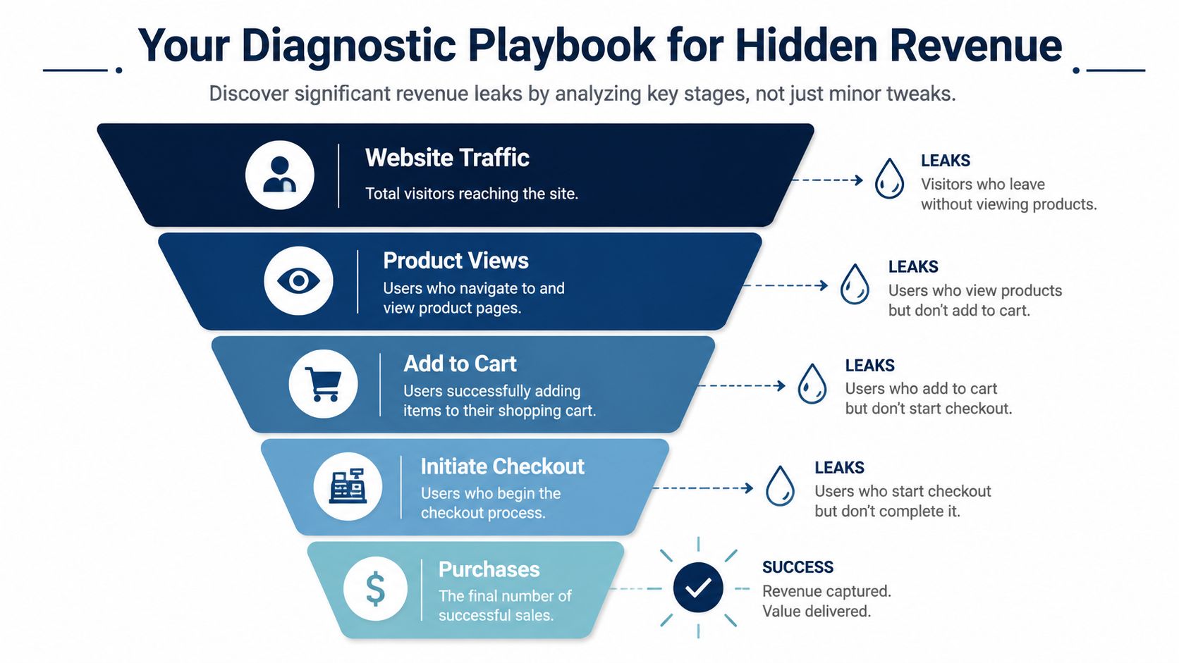
Open GA4 and map the path in plain English:
Then review drop-offs by page type, device, traffic source, and customer segment. Broad sitewide averages hide the underlying problem. You need the ugly cuts. Mobile paid social. Returning visitors on PDPs. Branded search traffic on category pages. That level of detail shows where money is getting stranded.
Keep the diagnosis blunt:
This data dictates your focus for the next month. It also protects you from wasting time on pages that are already doing their job.
Practical rule: Skip healthy pages. Fix the sharpest drop in the funnel first.
If category-to-PDP clickthrough is weak, checkout tests are a distraction. If add-to-cart is strong and checkout completion is poor, stop touching PDP creative and fix payments, shipping communication, and form friction.
Analytics shows the break. Behavior tools expose the cause.
Watch recordings from users who stalled on high-intent pages. On DTC sites, the same problems show up again and again:
Run a broader site review every quarter too. Conversion dashboards miss brand drift, weak offer hierarchy, and trust gaps that show up across the experience. A structured brand audit checklist helps catch those issues before they spread across every campaign and landing page.
Operators often lose the plot because they apply one CRO framework to two completely different selling environments.
You control the journey, so audit the full path:
The advantage on DTC sits in merchandising and journey control. Use that advantage. Customer feedback matters here because buyers often explain the friction in plain language long before it shows up cleanly in a report.
Amazon is a listing and retail readiness game. Treat it that way.
Focus on the variables you can control:
Your Amazon diagnostic work belongs in listing performance, search term behavior, and conversion differences across ASINs. If an ASIN gets traffic but converts poorly, improve the listing. If impressions are weak, fix discoverability, retail readiness, or both. Do not waste time applying DTC funnel logic to a marketplace page you do not control.
Most CRO backlogs reflect internal noise, not revenue potential.
Use a simple operator filter:
| Priority type | What it looks like | Likely action |
|---|---|---|
| High impact, low effort | Clear friction on high-traffic pages | Ship now |
| High impact, high effort | Checkout rebuild, search overhaul, mobile UX cleanup | Scope and phase |
| Low impact, low effort | Copy tweaks on low-traffic pages | Batch later |
| Low impact, high effort | Cosmetic redesign with no clear problem | Kill it |
Busy operators do not need more test ideas. They need a tighter queue, a sharper diagnosis, and a clear split between DTC fixes and Amazon fixes so the team works on the changes that drive revenue.
Most brands try to optimize persuasion before they've removed basic friction. That's upside down. If the site feels unstable, confusing, or untrustworthy, more aggressive CRO tactics just amplify the problem.
The unglamorous fixes usually pay first because they affect everyone.

Customers don't audit your site the way your team does. They feel it. Fast or clunky. Clear or annoying. Trustworthy or sketchy.
Audit these first.
A lot of founders assume their brand credibility is obvious. It isn't. New buyers don't know your ops are solid. They need evidence.
Put trust signals where purchase anxiety appears, not where your designer thinks they look elegant.
Buyers don't abandon because they hate your brand. They abandon because too many small doubts stack up at once.
For DTC brands, this means repeating key reassurance in the cart, on the PDP, and inside checkout. For Amazon sellers, trust comes through different mechanics. Listing completeness, image quality, review quality, and retail consistency do more of the credibility work that a DTC site might handle with policy content and service messaging.
A useful audit isn't philosophical. It's binary. Either the experience supports buying or it doesn't.
| Area | What to check | What good looks like |
|---|---|---|
| Mobile UX | Menus, filtering, CTA visibility, sticky elements | Shoppers can browse and buy without friction |
| Navigation | Category logic, search, sort, filters | Users find products quickly |
| Trust | Shipping, returns, support, policy visibility | Anxiety is answered before checkout |
| Consistency | Pricing, promotions, messages across pages | No surprises or contradictions |
| Distraction control | Popups, banners, app clutter | The path to purchase stays clear |
This is one of the most common operator mistakes. A store adds apps for upsells, reviews, SMS capture, loyalty, subscriptions, recommendations, and social proof. Each one looks useful in isolation. Together they turn the site into a blinking mess.
A shopper doesn't experience your tech stack. They experience friction.
Cut or delay anything that interrupts intent. If an app blocks product images, pushes the Add to Cart button down, overlaps mobile navigation, or interrupts checkout momentum, it's not helping revenue.
For DTC, your foundation is the entire storefront experience. Architecture, speed, trust, and flow all matter because you own all of it.
For Amazon, foundational discipline means retail readiness. Keep titles readable, images sharp, content complete, inventory stable, and pricing coherent. A weak listing doesn't need “CRO ideas.” It needs operational competence.
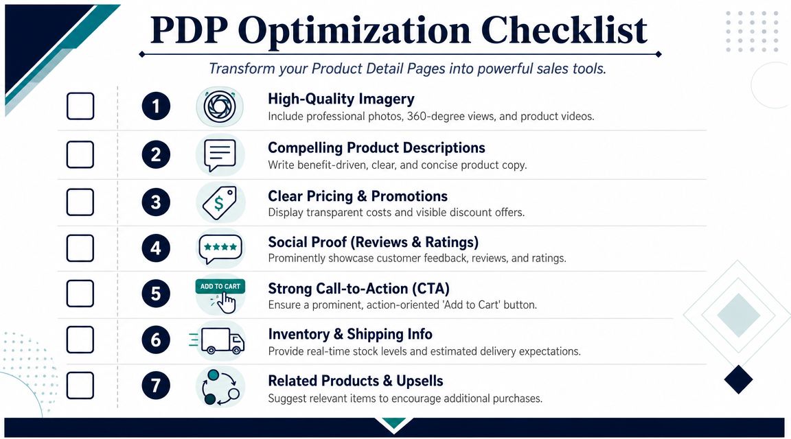
Your product detail page is where curiosity becomes conviction. If it doesn't answer questions, remove risk, and make the next action obvious, traffic leaks out.
This is the page most founders should scrutinize hardest. On DTC, it's your digital closer. On Amazon, the listing has to do the same job inside tighter constraints.
This sounds basic because it is basic. It still gets missed constantly.
BigCommerce's CRO guidance recommends keeping the Add to Cart CTA above the fold and visually distinct, along with using detailed product specs and support content that reduce the customer's need to research elsewhere, as outlined in BigCommerce's ecommerce CRO recommendations.
Your above-the-fold job is simple:
If customers have to scroll just to understand the offer, the page is underperforming.
Most PDP imagery is decorative. High-converting imagery is instructional.
That means your gallery should answer the questions customers would ask in person:
If you sell on Amazon, your visual system matters even more because shoppers skim fast and compare options side by side. Better image strategy often does more work than more copy. If your team needs a sharper framework for marketplace visuals, this guide to product photography for Amazon is worth reviewing.
Packaging matters too, especially in categories where presentation affects perceived quality. For food brands and giftable products, Afida's catering packaging tips are a useful reminder that packaging design influences buyer trust before the item is even opened.
Here's a useful example to study before rewriting your own media stack:
Founders often swing between two bad options on PDP copy. One is vague lifestyle fluff. The other is a wall of technical detail with no hierarchy.
Good product copy does three jobs:
Amazon itself notes sellers can A/B test product detail page elements such as titles, images, descriptions, and A+ Content through its listing optimization workflows, which is why content quality on marketplaces deserves the same rigor as DTC merchandising.
A product page should answer enough questions that the shopper doesn't need to open another tab.
This is one of the few CRO levers where the evidence is overwhelming enough that operators should stop debating and just execute.
Yotpo reports that user-generated content can increase conversion rates by as much as 200%, and another cited benchmark notes that products with 50+ reviews can convert 4.6x better than products with none, according to Yotpo's ecommerce conversion analysis.
The lesson isn't “install reviews.” The lesson is build review density, recency, and usefulness.
For Amazon sellers, social proof is even more central because shoppers trust the platform's review system as a core decision tool. If your listing has thin review coverage, don't kid yourself that a bullet rewrite will compensate.
Good PDPs help. Bad PDPs interrupt.
Cross-sells, bundles, and related items should support the decision already in motion. They should not hijack it. Keep the main path clear, then layer in relevant options that feel additive.
A strong PDP usually includes:
| PDP element | Why it matters |
|---|---|
| Clean hero media | Grabs attention and clarifies the product |
| Distinct CTA | Reduces hesitation at the moment of action |
| Structured product copy | Answers objections fast |
| Reviews and UGC | Lowers risk and builds trust |
| Shipping and return clarity | Prevents last-minute uncertainty |
| Relevant recommendations | Increases basket size without distraction |
Most brands don't have a conversion problem. They have a checkout problem.
Shoppers already told you they want the product. They clicked add to cart. They started checkout. Then the process punished intent. That's where revenue disappears.
Baymard's research puts average cart abandonment at about 70%, and it consistently identifies unexpected extra costs, forced account creation, and a long or confusing checkout as leading causes of abandonment in Baymard's ecommerce CRO research.

Nothing kills intent faster than surprise pricing near payment.
If shipping, taxes, duties, or fees appear too late, buyers feel tricked. It doesn't matter whether the total was reasonable. The emotional damage is already done.
So surface cost information earlier:
This matters even more for global brands. Local buyers expect local payment methods and cost transparency. Generic checkout advice won't solve market-specific friction.
Mandatory account creation is still one of the dumbest conversion killers in ecommerce.
A first-time buyer doesn't want a relationship yet. They want the product. Let them complete the order as a guest, then invite account creation after purchase when trust is higher and the cost of saying yes is lower.
If your retention strategy depends on forcing registration before payment, the strategy is broken.
Checkout forms bloat because internal teams add “useful” fields one by one. Finance wants something. Lifecycle wants something. Ops wants something. Soon the form asks for data you don't need to get paid.
Cut aggressively.
If you want a broader practical review of common abandonment points, this guide on how to reduce cart abandonment is a solid companion to a live checkout audit.
The best checkout feels short even when it isn't, because every step feels obvious and justified.
Payment friction is rarely dramatic. It's usually silent. The right method isn't there, so the buyer leaves.
Maropost's tactics roundup, cited in the verified data, notes that one-click checkout has been proven to increase conversion rates by 35% and that BNPL can boost conversions and average order values by 20% to 40%. That makes payment choice more than a convenience layer. It's part of the conversion engine.
What matters operationally:
On DTC, checkout is your responsibility. Own every field, message, wallet, and cost disclosure.
On Amazon, the platform handles most checkout mechanics. Your equivalent work is upstream. Price competitiveness, shipping speed, Prime eligibility, and listing confidence all shape whether shoppers ever move into the platform's purchase flow. Marketplace sellers should spend less time fantasizing about checkout redesigns they can't control and more time fixing the pre-checkout variables they can.
Once the store is clean, trusted, and easy to buy from, advanced levers start paying properly. Before that, they're mostly wasted.
Operators can create meaningful lift without cheapening the brand, not by throwing discounts around, but by aligning pricing, offer structure, and personalization so the offer feels more relevant and easier to say yes to.
A weak offer structure forces the product to carry all the persuasive load. A strong one reduces decision friction.
That doesn't mean constant discounting. It means making the buying decision easier:
For DTC brands, the best offers usually feel native to the product story. For Amazon sellers, pricing logic must account for marketplace comparison behavior. A DTC-style luxury narrative won't save a listing that looks overpriced next to near-identical options in the search results.
A lot of ecommerce personalization is fake sophistication. “Recommended for you” isn't valuable just because software generated it. It's valuable when it helps a buyer make a faster, better decision.
The highest-value personalization usually shows up in a few places:
Maropost highlights tactics such as semantic search, personalized search results, and AI-based relevance ranking as modern ways to improve shopping relevance. That matters because product discovery is often the hidden bottleneck. If shoppers can't find the right product fast, conversion work downstream won't rescue the session.
Good personalization here means:
Not every visitor deserves the same incentive.
A new visitor may need confidence. A repeat visitor may need urgency. A cart abandoner may need reassurance. A high-intent shopper comparing variants may need a recommendation, not a discount.
That's why behavior-based offers outperform generic promos. They match the moment.
Personalization should continue from ad click to landing page to PDP to cart. If your ad sells convenience, but your landing page leads with craftsmanship, and the PDP leads with technical detail, the experience feels disjointed. Message match is part of personalization too.
Better personalization doesn't feel “personalized.” It feels obvious, relevant, and frictionless.
These two levers are stronger in combination than in isolation.
A shopper sees the right product faster, then sees credible proof that other buyers trust it. That sequence lowers uncertainty and shortens deliberation. It's one reason mature ecommerce brands win through relevance and trust, not just catalog size.
Verified data also supports the broader direction here. E-commerce CRO guidance consistently notes that personalized shopping experiences, AI-powered recommendations, and behavior-based offers can raise engagement and conversions by putting the right products in front of the right people at the right time. The implication is simple. Relevance compounds.
The fastest way to waste time is treating these as interchangeable.
| Channel | Best advanced lever | What to avoid |
|---|---|---|
| DTC | Bundles, threshold offers, behavior-based recommendations, personalized search | Blanket discounts that train customers to wait |
| Amazon | Pricing discipline, coupon strategy, listing relevance, variation clarity, retail readiness | Overcomplicated brand storytelling that doesn't help comparison shopping |
DTC lets you shape the journey. Amazon forces compression. Shoppers compare quickly, trust platform signals heavily, and reward clarity. So keep the tactics channel-native.
Don't deploy advanced personalization on top of a broken store. Fix the fundamentals first. Then use pricing and personalization to sharpen intent, increase basket size, and reduce unnecessary decision load.
That's how advanced CRO should work. Not as decoration. As a force multiplier for a functioning machine.
Random tests do not create growth. A repeatable decision system does.
Brands plateau because the team keeps shipping opinions instead of running a disciplined loop. Progress stalls for this reason. Nobody can separate signal from noise, nobody learns fast enough, and the same bad ideas keep coming back in new packaging.
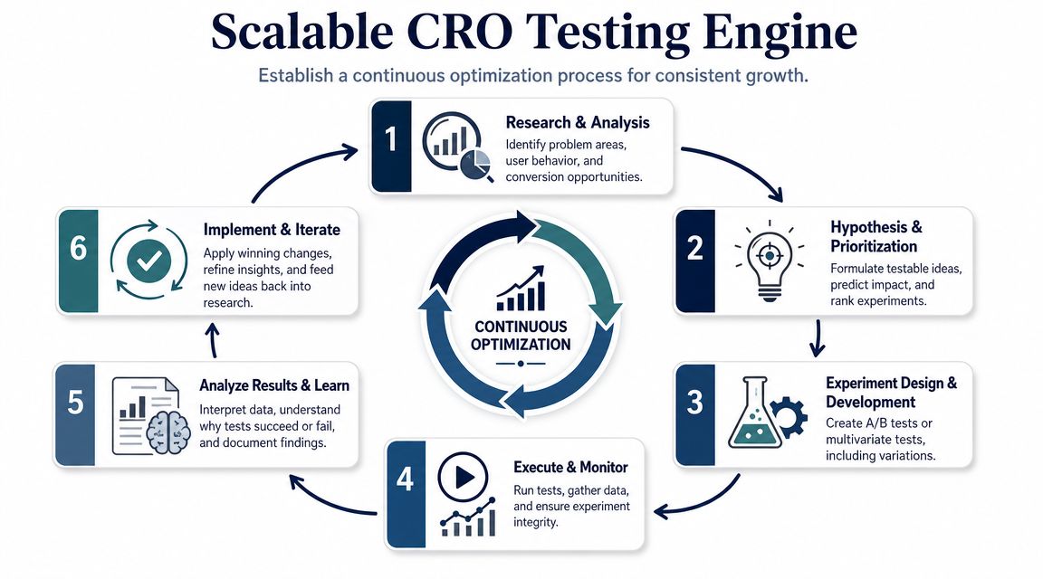
The structure is simple. Research the friction. Form a sharp hypothesis. Prioritize by likely revenue impact and speed to launch. Run clean tests. Document what you learned. Repeat without drama.
Weak hypothesis: “A cleaner PDP design will convert better.”
Strong hypothesis: “If we move shipping and return messaging closer to the Add to Cart button on top PDPs, more high-intent shoppers will add to cart because reassurance appears before they hesitate or leave.”
That gives your team four things:
If a hypothesis cannot answer those four points, it is not ready for the queue.
You do not need a fancy model. You need a scoring system your team will use every week.
Experiment Prioritization Framework (ICE Score)
| Metric | Description | Score (1-10) |
|---|---|---|
| Impact | How much this test could improve revenue-critical behavior | 1-10 |
| Confidence | How strongly data supports the hypothesis | 1-10 |
| Ease | How quickly and cleanly the team can launch the test | 1-10 |
Use the combined score to rank the backlog. A checkout field removal with clear friction evidence should beat a homepage redesign that looks exciting in Figma and lacks diagnostic support.
This effort-versus-impact filter matters even more for lean teams. Founders and operators do not need more ideas. They need fewer, better bets.
A workable cycle looks like this:
Winning tests make money. Losing tests still matter if they produce a reusable lesson.
DTC and Amazon need different operating rules.
On DTC, you control far more of the buying journey, so your backlog should include page structure, merchandising order, copy hierarchy, offer framing, bundles, navigation, cart flow, and checkout friction. You can test the full path from first click to purchase.
On Amazon, your room to maneuver is narrower. Focus on listing images, titles, bullets, A+ content, coupon strategy, pricing discipline, variation structure, review velocity, and retail readiness. Do not force a DTC experimentation mindset onto a marketplace that controls the page, the cart, and much of the trust layer. That creates busywork, not lift.
Teams lose money when they forget their own test history. Six months later, someone revives the same concept, nobody remembers the prior result, and the team burns time relearning an old lesson.
Create a test library with:
That record becomes your operating memory. It sharpens future prioritization, stops duplicate work, and makes each test more valuable than the revenue it generated on its own.
If you're already operating at scale and want sharper behind-the-scenes strategies from founders solving these problems across Amazon, DTC, and omnichannel, Million Dollar Sellers is where serious operators compare notes, pressure-test decisions, and scale with better information.
Join the Ecom Entrepreneur Community for Vetted 7-9 Figure Ecommerce Founders
Learn MoreYou may also like:
Learn more about our special events!
Check Events