
Chilat Doina
February 15, 2026
Building a strong brand is about so much more than just a cool logo or a catchy tagline. It's the whole vibe—the feeling customers get when they see your packaging, read your emails, or use your product. It’s what turns a one-time buyer into a loyal fan. This is where you lay the groundwork, defining your core purpose, values, and how you stack up against the competition.
Get this right, and every single thing you do, from your color choices to your content, will work together to create an experience that’s authentic and unforgettable. This process is what elevates you from just another seller to a brand people genuinely care about.
Before a single pixel is pushed in a design file, you have to build an unshakeable strategic foundation. This is the deep work, where you move past what's trendy and figure out the very soul of your business. It's all about nailing down why you exist, which then becomes the north star for every single decision you make down the road.
So many entrepreneurs get excited and jump straight to the fun visual stuff. I get it. But a powerful brand identity is simply an expression of an even more powerful strategy. It all starts with introspection, not illustration. If you really want to get into the nitty-gritty of brand strategy, there are some great comprehensive branding resources out there that can help.
Your brand’s purpose is your reason for being—and no, it’s not just “to make money.” It’s the positive dent you want to put in the universe for your customers. Take Patagonia. They don't just sell jackets; their purpose is to "save our home planet." That single idea drives everything, from the materials they use to their political activism.
To find your own purpose, you have to ask some tough questions:
Next up are your values. These are the non-negotiable principles that guide how you operate. Think of them as promises you make to your customers and your team. Please, don't just slap generic words like "integrity" or "quality" on your website. Make them real and actionable. If "sustainability" is a core value, how does that actually show up in your sourcing, your packaging, and your day-to-day operations?
A brand's identity is the tangible expression of its core purpose and values. When strategy and design are aligned, customers don't just buy a product; they buy into a belief system. This alignment is what creates unwavering loyalty and allows a brand to command a premium.
This process—defining your purpose, articulating your values, and then sizing up the competition—is the bedrock of your entire brand.
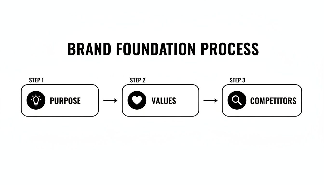
As you can see, a clear purpose is the starting point. It informs the values that guide your actions, and from there, you can analyze the competitive landscape to define your unique spot in the market.
Let’s be clear: looking at your competitors isn't about copying them. It’s about finding opportunities to be radically different. A solid competitor analysis helps you see how other brands in your space are positioning themselves, what they sound like, and what their visual identity says about them.
Start by picking your top three to five direct and indirect competitors. Then, go deep. Analyze their:
This research is where the gold is. You'll start to see gaps in the market. Maybe every competitor has a loud, aggressive aesthetic, leaving a wide-open lane for a brand that’s calm and minimalist. Or perhaps they all compete on being the cheapest, creating a perfect opportunity for a premium, high-touch alternative.
Your goal is to find that unique position that only your brand can own. To get a better handle on this critical first phase, you can dig deeper into how to develop brand strategy and set yourself up for success from day one.
If your brand strategy is the skeleton, then your voice and messaging are what give it a personality. This goes way beyond just picking a word like "friendly" or "professional." We're talking about developing a complete verbal identity—a guide for how you talk in your ads, on your product pages, and even in customer service emails.
It's this consistency that builds real recognition and trust with customers.
Think of your brand’s voice as its unique verbal fingerprint. Is it witty and clever like Dollar Shave Club, or is it inspiring and empowering like Nike? The right voice doesn't just describe what you sell; it creates a feeling and sparks a connection. When a customer reads your stuff, they should feel like they're hearing from a consistent, recognizable personality every single time.

For any e-commerce business trying to get noticed, this is non-negotiable. Your voice is one of the few tools you have to set yourself apart in a ridiculously crowded market before a customer even holds your product. It’s what turns a simple transaction into a memorable brand experience.
A classic mistake is picking a single adjective to define a brand's voice. A truly solid brand voice is multi-dimensional, just like a person. A great framework I've used for years is to choose four core attributes and then clearly define what each one means for your brand.
Let's say a premium coffee brand wants to nail down its voice. It might look something like this:
See how that works? This framework gives your entire team—from copywriters to social media managers—clear guardrails. They know they can be witty, but not sarcastic. They can be experts, but not arrogant. This clarity is what prevents "brand schizophrenia," where your emails sound corporate while your Instagram is flooded with slang.
Your brand story is the why behind your what. It’s not some long-winded "About Us" page nobody ever reads. It’s a tight, emotionally resonant narrative that explains your origin, your mission, and the problem you solve for people.
A great story answers three key questions:
This narrative becomes the source material for all your marketing. Your tagline is just the shortest possible version of that story. Think of FedEx's old tagline, "When it absolutely, positively has to be there overnight." In just nine words, it screams reliability, speed, and a high-stakes promise. It’s a masterclass in messaging.
Your tagline isn't just a catchy phrase; it's a promise. It should encapsulate your core value proposition and be memorable enough to stick in your customer’s mind long after they’ve left your site.
Once you have your voice and story, you need to structure your message so it makes sense to people. A messaging hierarchy ensures you're communicating the most important things at the right times. It’s basically a communication pyramid that guides everything from high-level ad campaigns down to the text on a button.
Here’s a simple way to structure it:
This structure is the secret to consistency. Your homepage might focus on the high-level value proposition, a product category page will lean on the relevant messaging pillars, and the individual product description will dive deep into the supporting proof points. This systematic approach is a cornerstone of building a brand identity that feels cohesive and trustworthy at every single touchpoint.
Once your strategy is nailed down and you've found your voice, it's time to give your brand a face. This is the fun part, where abstract concepts like “trustworthy” or “playful” become tangible through color, shape, and typography. A powerful visual identity is so much more than just a logo; it's a complete, cohesive system that instantly tells the world who you are.
It’s no secret that visuals hit us hard and fast—in fact, our brains process them 60,000 times faster than text. This makes your design choices one of the most immediate ways to connect with a potential customer. A well-designed system ensures that every touchpoint—from an Instagram ad to your website to the unboxing experience—feels familiar, professional, and undeniably you. This is how you start building real brand equity.
Your brand’s color palette is a potent emotional tool. Colors trigger feelings and associations deep within our brains, so your choices here are incredibly strategic. Blue often signals trust and security (think finance or tech), while yellow can spark optimism and energy. The goal is to pick a palette that not only looks great but also reinforces the core feelings you want your brand to inspire.
A common rookie mistake is going overboard with colors. A strong, professional visual identity typically relies on a tight, purposeful palette:
Typography works the same way. The fonts you choose say a ton about your brand's personality. A classic serif font (like Times New Roman) can feel established and authoritative, while a clean sans-serif (like Helvetica) often comes across as modern and approachable. Your job is to find a font pairing—one for headlines, one for body text—that both reflects your brand and is a breeze to read on any screen.
A brand's visual identity should function like a well-tailored suit. It should fit the brand's personality perfectly, look sharp and professional in any situation, and make an unforgettable first impression without saying a word.
Your visual identity isn't just about a logo and some colors; it's a comprehensive system that dictates how your brand shows up in the world. To truly bring it all together, we need to consider every single visual element.
The table below breaks down the core components you'll need to define. Think of it as a checklist for building a visual identity that’s both beautiful and built to last.
.tbl-scroll{contain:inline-size;overflow-x:auto;-webkit-overflow-scrolling:touch}.tbl-scroll table{min-width:600px;width:100%;border-collapse:collapse;margin-bottom:20px}.tbl-scroll th{border:1px solid #ddd;padding:8px;text-align:left;background-color:#f2f2f2;white-space:nowrap}.tbl-scroll td{border:1px solid #ddd;padding:8px;text-align:left}Visual ElementStrategic PurposeKey ConsiderationsLogo SuiteTo provide a versatile and recognizable mark for all applications, from tiny favicons to large banners.Scalability, legibility, and memorability. Does it work in black and white?Color PaletteTo evoke specific emotions and create a consistent, recognizable look across all marketing materials.Psychological associations, competitor palettes, and accessibility (contrast).TypographyTo establish a clear informational hierarchy and convey brand personality through font choices.Readability on all screen sizes, licensing, and pairing (headline vs. body).Photography StyleTo create a consistent mood and tell a cohesive story through all brand imagery.Lighting (natural vs. studio), subject matter, color grading, and composition.Iconography & GraphicsTo provide simple, universally understood visual cues that align with the overall brand aesthetic.Style (line art, flat, 3D), consistency in stroke weight, and brand relevance.Patterns & TexturesTo add depth, interest, and a unique branded touch to backgrounds and marketing materials.Subtlety, scalability, and alignment with the core brand personality.
By thoughtfully defining each of these elements, you're not just designing—you're building a strategic asset. A well-documented visual system ensures that no matter who is creating content for your brand, it always looks and feels like it came from the same place.
Your logo is the face of your company, but one size rarely fits all. A single, intricate logo design simply won’t work as a tiny social media profile picture and a massive trade show banner. This is precisely why smart brands create a versatile logo suite—a family of logo variations designed for different situations.
A complete logo suite usually includes:
Having these variations ready to go makes your brand look polished and professional, no matter where it shows up. For a deeper dive into documenting all these visual rules, check out our guide on how to create brand guidelines.
Your visual identity goes way beyond your logo and colors; it touches every single image and graphic you use. Without clear guidelines, your visual presence can quickly turn into a chaotic mess, completely undermining the professional image you've worked so hard to build.
First, lock down your photography style. Are your product shots bright and airy with natural light, or are they dark and moody with dramatic shadows? Are the people in your lifestyle shots smiling and candid, or are they posed and editorial? This consistency is what makes a brand’s Instagram feed or website feel curated and intentional.
Next, set some rules for graphic elements like icons, illustrations, and patterns. These should feel like they belong to the same family as your logo and typography. For fashion brands, using AI product to model tools can be a game-changer for presenting products professionally and maintaining that crucial visual consistency. By creating one unified system for all your visuals, you build a powerful, memorable brand that truly stands out.
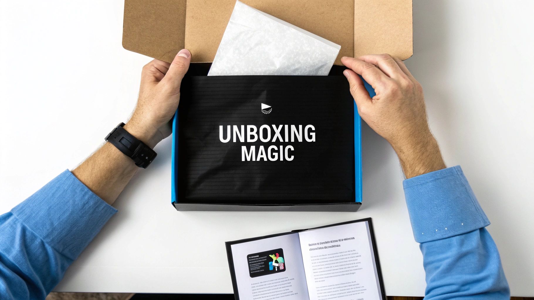
For any e-commerce brand, the journey your product takes to a customer’s doorstep is a massive blind spot. The unboxing is your first—and often only—physical handshake. It's the moment your digital brand becomes a tangible reality, and you can either make it forgettable or turn it into a powerful branding moment.
This isn't just about sticking a product in a brown box. A thoughtfully designed unboxing experience makes customers feel like they've invested in something special, justifying your price point and forging an emotional connection a website simply can't.

Think of the outer mailer as your mobile billboard. It’s the first thing customers see, so it needs to do more than just survive transit. A custom-printed box with your logo, a splash of your brand color, or even a clever tagline immediately elevates the entire experience. It signals that what’s inside is from a legitimate, professional brand—not just another random seller.
But the real magic happens once they open it. Think about creating layers of discovery. Instead of settling for packing peanuts, consider these elements:
These details transform opening a package from a simple chore into an exciting event.
Once that box is open, you have a captive audience. This is your chance to deepen the connection and drive future action. Package inserts are incredibly low-cost, high-impact tools that can turn a one-time buyer into a repeat customer and brand advocate.
The unboxing experience is the bridge between the digital promise and the physical product. When executed well, it reinforces the brand's value, encourages social sharing, and creates a memorable moment that turns customers into loyal fans.
Instead of a generic packing slip, use this opportunity to tell your brand story. A simple, well-designed postcard can make a world of difference.
Every insert should have a clear purpose. Are you trying to get a review, encourage a social media share, or drive a second purchase? My advice? Focus on one primary call to action to avoid overwhelming the customer.
Here are a few ideas I've seen work time and time again:
Ultimately, a standout unboxing experience is a core part of how to build brand identity in e-commerce. It’s a direct reflection of your brand's attention to detail and commitment to your customers, creating a lasting impression that turns a simple delivery into a loyalty-building moment.
You’ve done the heavy lifting—you've built the strategic foundation, crafted a unique voice, and designed a killer visual system. But let's be honest, a brilliant brand identity is totally useless if it just collects dust in a forgotten folder.
The real test starts now. It's time to turn those guidelines into a living, breathing reality across every single place a customer might interact with you. This is the disciplined work that separates fleeting sellers from iconic, trusted brands.
This isn’t just about looking good; it's a powerful driver of business results. When you’re consistent everywhere, you can skyrocket revenue by up to 23%. Brands that nail a uniform visual identity enjoy 3.5 times higher visibility, and an incredible 68% of companies report direct revenue growth from their branding efforts.
Relentless consistency is the secret sauce. Your website, Amazon listings, social media profiles, and ad campaigns must all sing from the same hymn sheet. This cohesive experience is what builds the deep recognition and trust that actually drives growth. Without it, you're just making noise.
Think of your brand style guide as the single source of truth for your entire organization. It’s a practical, actionable document that empowers your team, freelancers, and agency partners to execute your brand identity flawlessly.
Forget some 100-page theoretical document nobody will ever read. This needs to be a user-friendly playbook that's clear, concise, and full of real-world examples. It should leave zero room for interpretation.
What to include in your style guide:
This document is the cornerstone of brand governance. It removes guesswork, speeds up content creation, and ensures every piece of communication reinforces the identity you’ve worked so hard to build.
Your brand style guide isn't a set of restrictive rules; it's a tool for creative empowerment. It gives your team the confidence to create on-brand content quickly and consistently, protecting your most valuable asset—your brand's integrity.
This central resource is what allows you to scale your marketing without watering down your brand’s power.
Your direct-to-consumer (DTC) website and your Amazon store are your two most critical digital storefronts. They need to feel perfectly aligned, yet each must be optimized for its own unique environment.
On your DTC site, you have complete creative control. This is your home turf—use your brand's visual identity to its absolute fullest. We're talking custom banners that reflect your photography style, call-to-action buttons in your exact brand colors, and copy that sings with your defined brand voice. The entire user experience should feel like an immersive journey into your brand's world.
Amazon, on the other hand, presents a different challenge. You have less control, but you can still create a powerful branded experience using the tools they give you.
Key areas for brand activation on Amazon:
A customer hopping from an Instagram ad to your Amazon page and then to your website should feel like they are interacting with the same brand at every step. This seamlessness is a key part of how to build brand identity that feels reliable and authoritative. It's also a direct driver for how to build brand awareness, making you instantly recognizable wherever customers find you.
Building a brand identity from the ground up always kicks up a lot of questions. Ecommerce founders, in particular, need straight answers to make smart moves. Here are the most common things we hear from entrepreneurs in the trenches.
This is the million-dollar question, isn't it? The truth is, your brand identity budget can be all over the map, and it really depends on your approach.
Going the DIY route with online logo makers and font libraries can keep costs down to just a few hundred dollars for tools and licenses. It's a start, but you often get what you pay for—a look that lacks real strategic thinking.
Hiring a solid freelance designer to build out your core package (think logo suite, color palette, and typography) will usually land you in the $2,000 to $10,000 range. For most e-commerce startups getting serious, this is the sweet spot.
If you're looking for the whole nine yards from a small studio or agency—market research, deep strategy, and a full brand guide—you can expect to pay anywhere from $15,000 to $75,000+.
It’s critical to see this as an investment, not just another line item expense. A killer brand identity directly shapes how customers see you, gives you permission to charge premium prices, and builds a real, long-term asset for your business. A realistic starting budget for a professionally built identity often falls in the $5,000-$15,000 range.
Yes. A thousand times, yes.
Now, you don't need a pixel-perfect, 80-page brand book before your first order comes in, but launching with a solid foundation is completely non-negotiable. You absolutely have to establish a professional-looking identity before a single customer lays eyes on your product.
At the bare minimum, this means you need:
Trying to slap a brand on after you already have some traction is a nightmare. It’s way more difficult and expensive, it confuses your early fans, and you have to update every single asset you’ve ever created. Start with a thoughtful identity you can build on, not a blank slate you have to fix later.
If there’s one mistake that can single-handedly tank your brand, it's inconsistency.
You could have the most brilliant logo and the cleverest brand voice in the world, but if they aren't used the same way everywhere, they’re worthless.
When a customer sees one set of colors on your website and another on your packaging, it's jarring. When they get a formal email but see you cracking jokes on social media, it creates a disconnect. This kind of fragmentation makes your brand feel amateurish and, frankly, untrustworthy.
The fix is pure discipline. Create a simple brand style guide right from the start—even a one-pager will do. More importantly, enforce it across every single place a customer interacts with you. We're talking product listings, ad campaigns, customer service replies, and package inserts.
Consistency is what builds recognition. It’s the engine that drives trust and turns casual shoppers into die-hard fans. This is the real secret behind every powerful brand.
At Million Dollar Sellers, we know that building a powerful brand is just one piece of the puzzle. Our exclusive community connects elite e-commerce entrepreneurs with the peer insights, strategies, and network needed to scale past 7, 8, and 9 figures. If you're ready to learn from the best in the business, see if you qualify to join MDS. Learn more at https://milliondollarsellers.com.
Join the Ecom Entrepreneur Community for Vetted 7-9 Figure Ecommerce Founders
Learn MoreYou may also like:
Learn more about our special events!
Check Events